DICK'S TSHQ Registration Redesign
DICK'S Team Sports Headquarters is one of the leaders in the space of software for youth sports—with over 3,000,000 players and over 10,000 team websites, all counting on our products to make their lives and jobs easier.
One of the main products at TSHQ is the online registration experience to sign up participants for their respective leagues and teams. The challenge with this project was bringing our bloated and dated software up to the level of quality that customers have come to expect in the age of smartphones and social media.
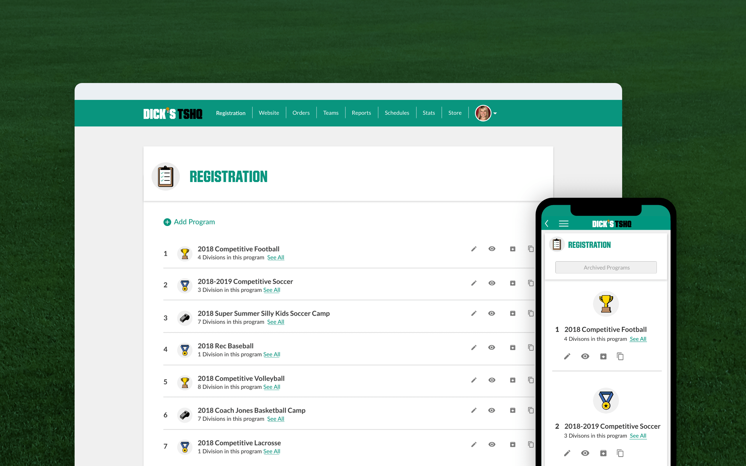
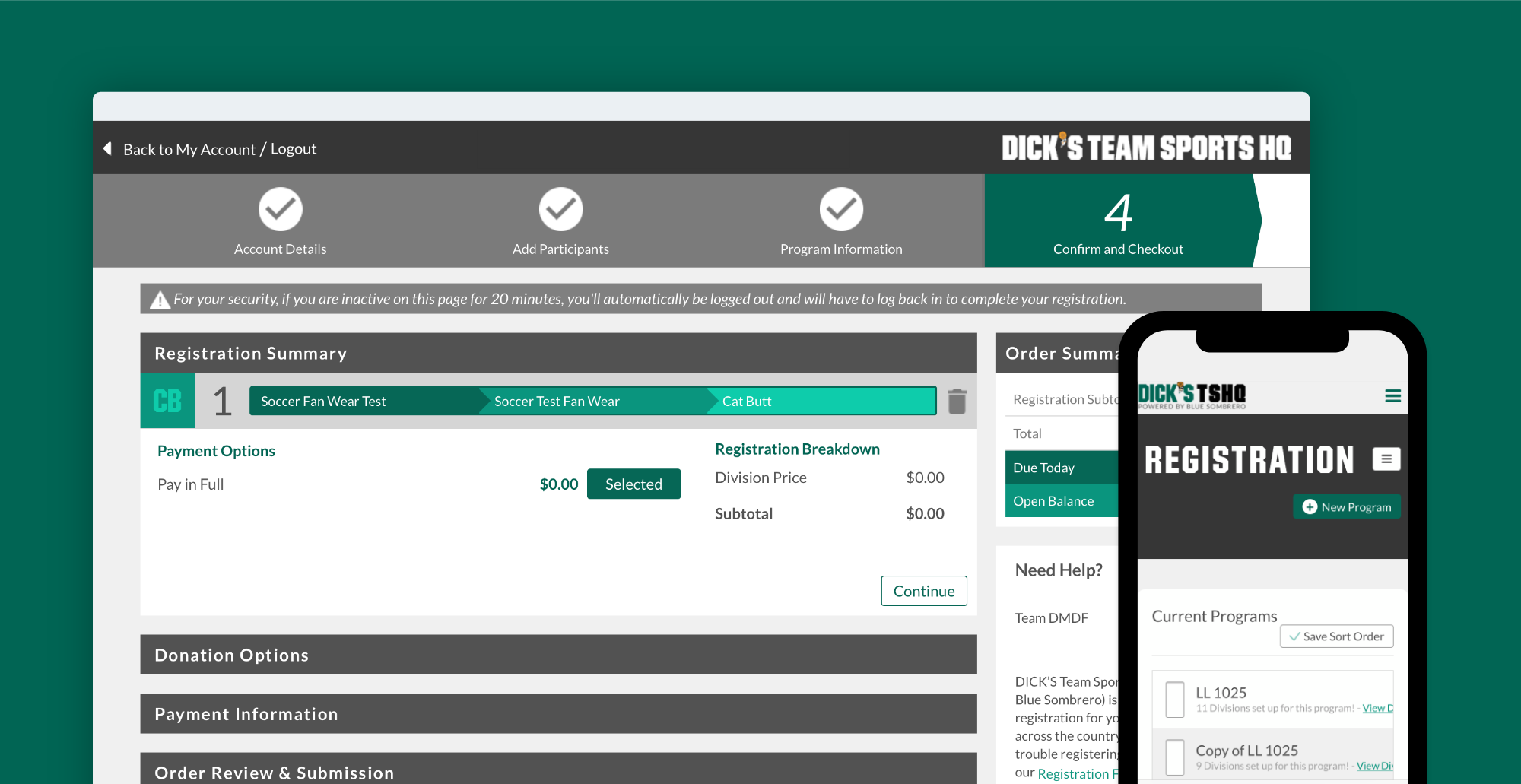
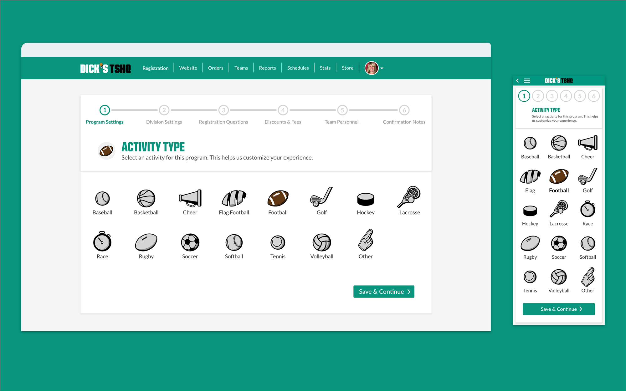
Previous TSHQ registration UI.
The Challenge
Year after year new features and functionality were added without considering the effect on the product as a whole. The result was a monstrosity with no cohesive UI and a poor user experience.
A complete, front to back redesign was called for in order to overhaul the entire registration process. My team, the UX team, was tasked with that challenge and tried to innovate as much as possible to keep DICK'S TSHQ on the forefront of youth sports.
Research
A key step in this redesign was understanding how current users interacted with the product and the different goals they would each have. We conducted interviews with current administrators, non-governing bodies, parents and coaches about their experiences with the product and how and what they used it for. We also gathered information from our customer support team, and determined a multitude of issues and pain points that needed to be addressed.
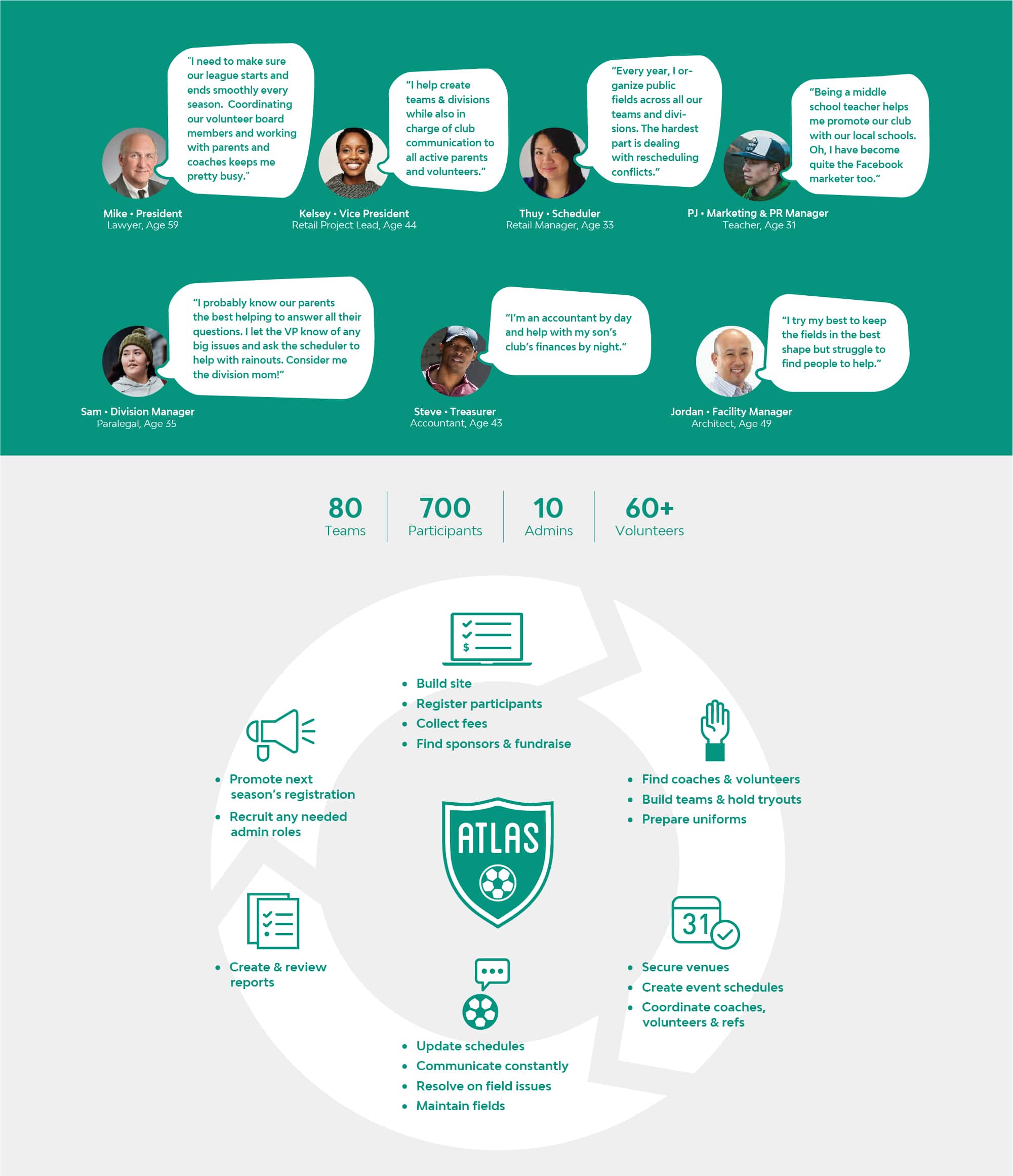
I created personas and my team extrapolated how and what these users use the product. Based on research data and interviews, we identified current issues with the product, user needs and our own business goals and requirements. We created assumptions for how best to solve our biggest issues based on those observations and insights.
Assumptions
Mobile Experience
The legacy mobile version of our registration process was so outdated that it was essentially unusable. It had been built before smartphones existed, and was nearly impossible to use. When looking at our analytics we could see that the abandonment rate for registration on mobile was at 88%. On desktop it closer to an 18% rate of abandonment. Our users indicated a large pain point was not being able to complete these tasks on the go, and essentially being forced to sit at a desktop or laptop computer to complete the process.
Improving the user experience for mobile devices will decrease the abandonment rates for mobile and will greatly increase our overall registrations completed from mobile devices.

Previous TSHQ mobile UI.
Guiding the User
The process for completing the registration process was confusing to users. Many were unsure as to what tasks they were trying to accomplish at any given moment. TSHQ has a support website with tutorials and walkthroughs for every step of the registration process, but they involve reading pages of information and watching long explainer videos. On top of this, the legacy UI was inconsistent and confusing. Our support team would get weekly calls for simple tasks that should not be an issue. The amount of support calls tagged with "registration issues" in Zendesk were hovering around 45% year over year.
Giving users a greater sense of context by instructing them on tasks with less text to read, and leading them with prompts to begin a task, will reduce confusion and reduce the frequency of calls to our support team.
Improve Fan Wear Sales
This was more of a business goal and problem than design one, but my team was still tasked with solving it. We introduced a fan wear store a few years ago to allow people to wear their team colors and show team spirit. Fan wear sales were not particularly stunning. The online stores for fan wear had to be sent through a special link by an administrator and when users did find the store, the lack of products and the bad UI and UX did not add a lot of confidence that this was a legit website at all.
Including fan wear into the registration process will greatly increase our sales of fan wear merchandise and reduce friction of the experience.
With these assumptions in mind we began an array of different tests to put them through the paces and try to validate them as best we could.
Process before design work
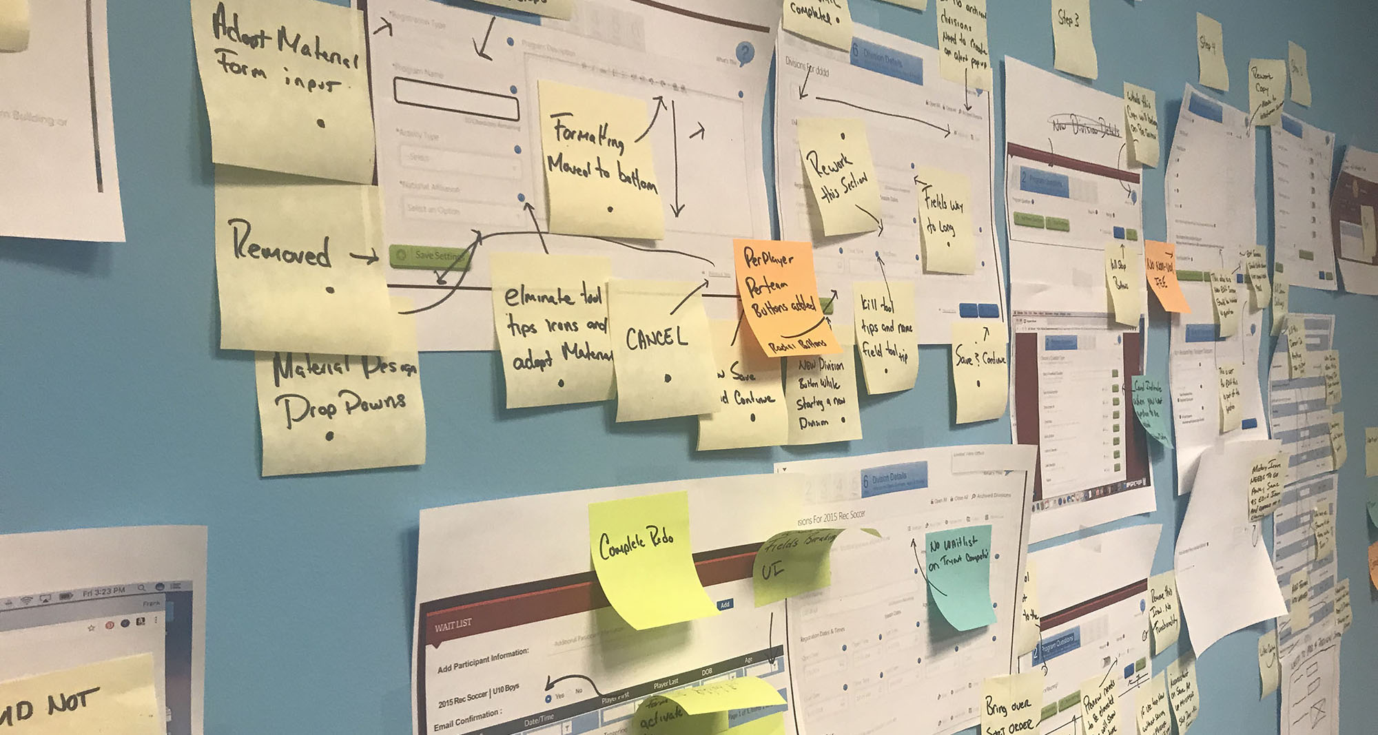
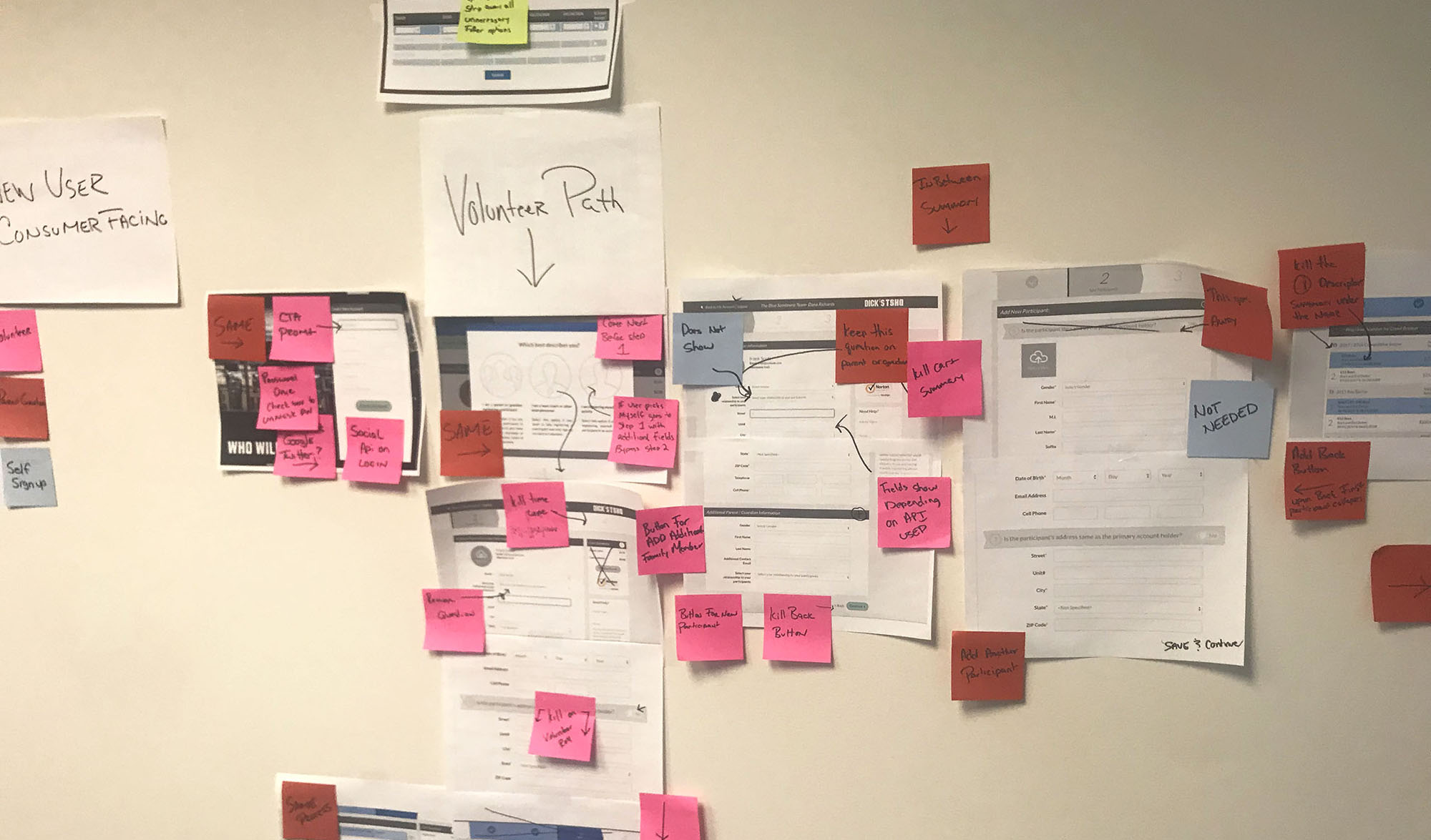
My team used affinity mapping to break down every screen of the registration process. We discussed every single aspect good and bad. We documented what we should keep what we should kill, what we should overhaul.
A refined information architecture was created as were wireframes after we had removed unnecessary steps and screens in our process. We worked with the development team to see what was feasible and realistic and what may cause future issues. With this new IA in mind, I created wireframes, highlighting what requirements were needed for each screen.
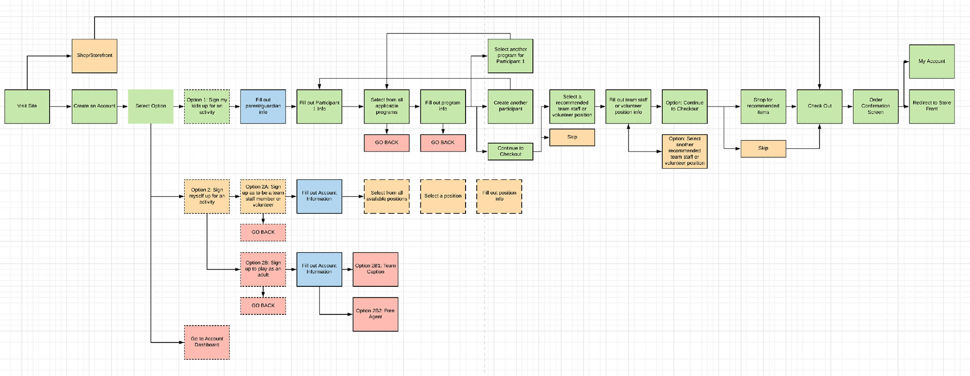
Refined IA.
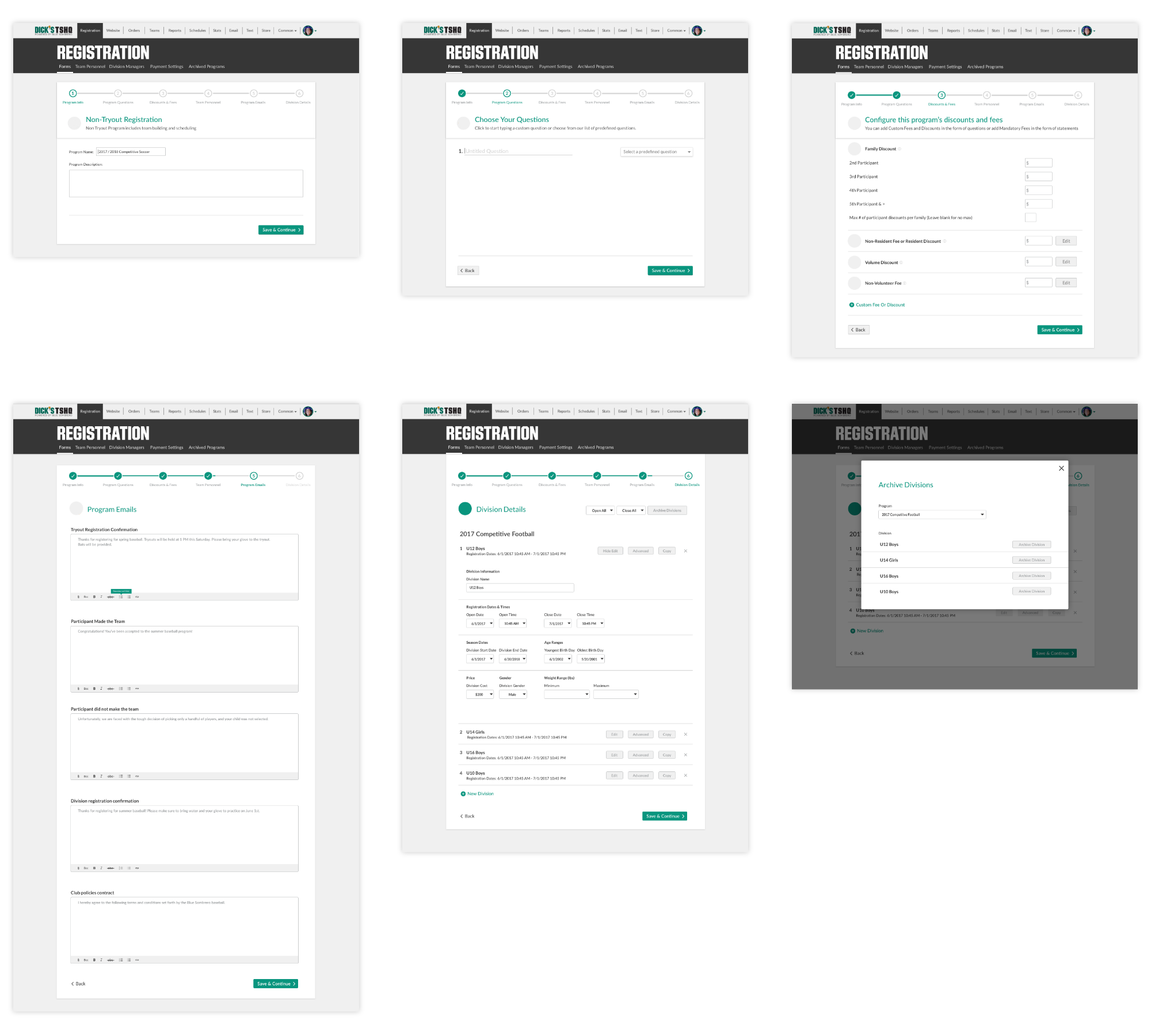
Lo-Fi designs.
Testing and Validating Assumptions
We tested our initial assumptions with low fidelity designs through methods such as: A/B tests, user interviews, prototype walkthrough, and user surveys. We tested our prototypes remotely as well as in person at Atlanta area DICK'S Sporting Goods stores via some guerilla testing.
After testing our assumptions, we felt that we had validated many of them and developed strong solutions on how to solve our issues.
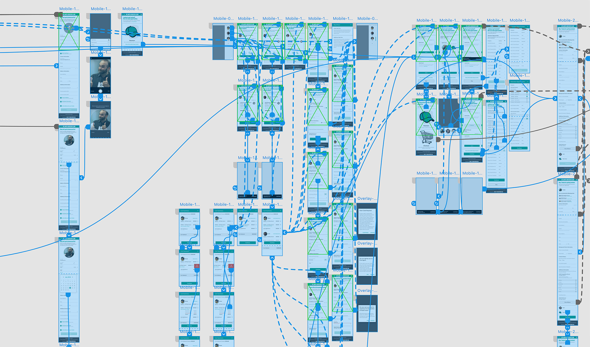
Prototype screen in Adobe XD.
Art Direction and Style
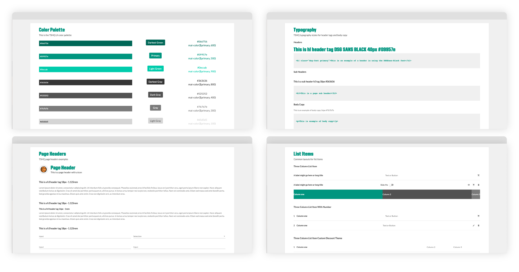
An art direction was established for the redesign as well as a design system with elements that would work for both mobile and desktop. We decided to use a modified version of Google Material Design for ease of use. Instead of using everything strictly material, we customized components to create our own look and feel for the product, so it didn't just end up looking like every other Android app you see in the wild.
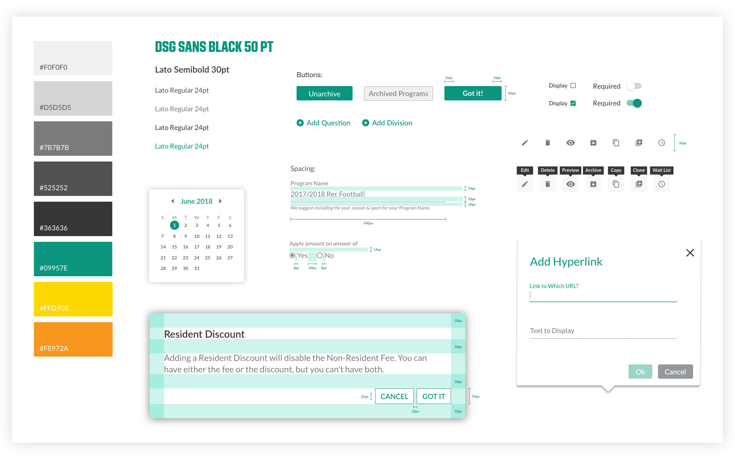
Style guide.
I created an illustration style that would serve to liven up the, at times, mundane registration process full of text fields and forms and bring in a touch of fun.
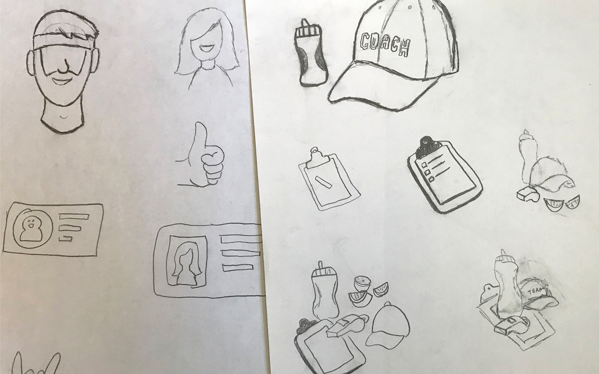
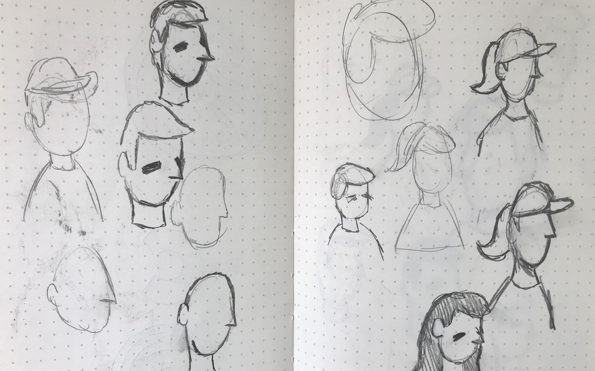
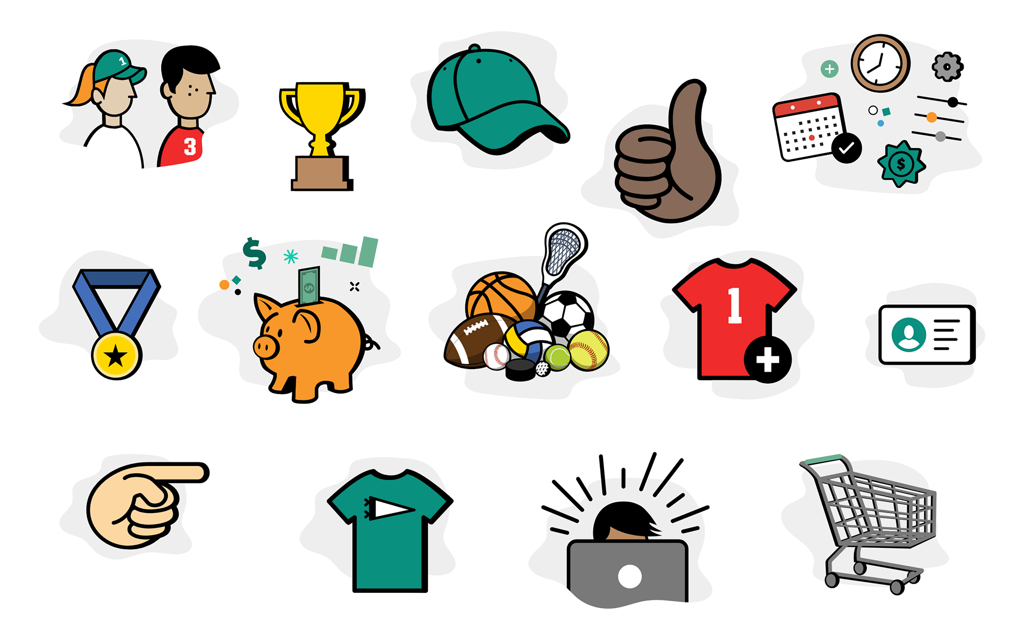
After all the pieces had been discussed and vetted with stakeholders, and once we got sign off on an art direction and style, we started building full fidelity screens. The actual design work for the screens were split in half by myself and another teammate, with each of us designing 3 of the 6 steps of the registration process for both mobile and desktop.
Design System
Before development work began, I collaborated with the dev team to help create a design system incorporating the elements of the redesign in order to expedite the development process. This step streamlined the process and reduced friction within the designer/developer relationship. This also considerably cut back on our QA time as all the elements—type sizes for different areas, button sizes, margins, colors, etc—were all clearly defined and agreed upon as to help serve the product best.
Design Solutions
Solving the Assumptions: Mobile Experience
By designing with a mobile first approach we were able to address many of the harder to solve for issues associated with our multi-step registration process by consolidating and refining the UI. We emphasized a clearer hierarchy, and made the entire user experience more understandable and enjoyable.
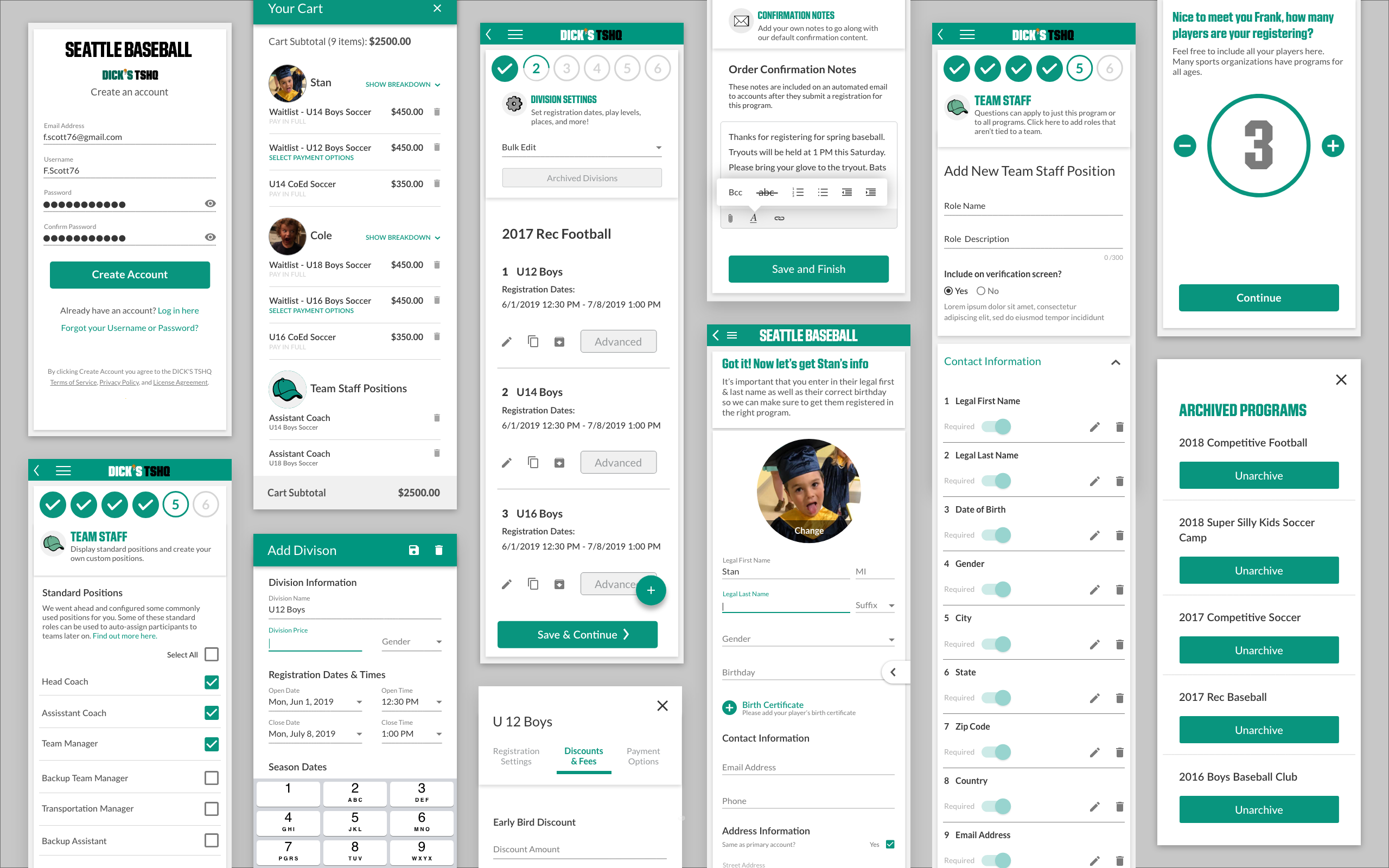
Mobile screens.
Guide the User
Users had a better understanding of objectives they needed to complete during the registration process when given more guidance and context as to what they were trying to accomplish. The simplified and decluttered UI of the redesign also helped with the user having a better understanding of objectives.
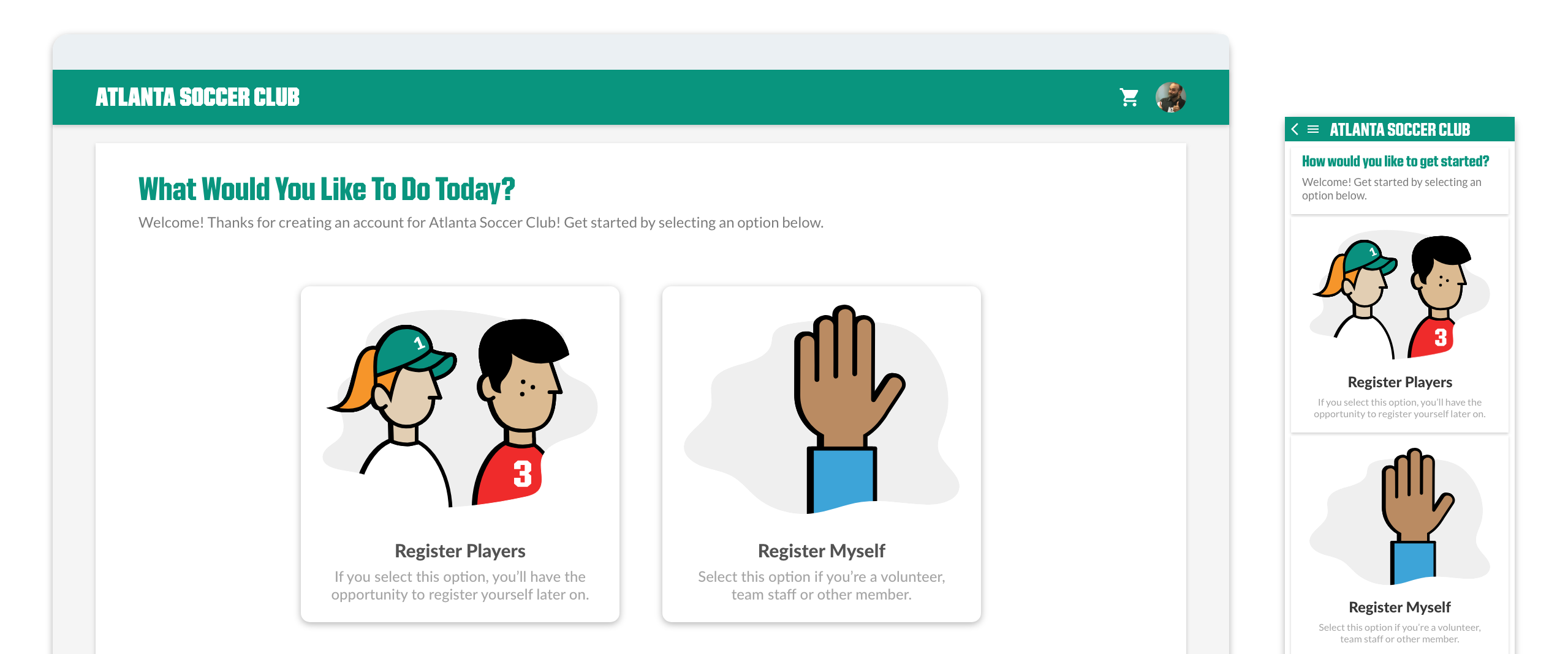
We created a more conversational approach to the UI, in how it interacted with our users. This helped them to see a clearer path in their goals when using the product.
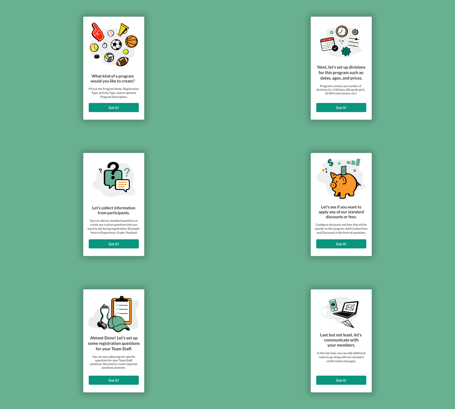
Between each of the 6 steps of the registration process, a screen would appear with a quick and simple overview of what tasks the user was trying to accomplish. We referred to these as "context screens" as they were giving the users context and clarity along the registration journey. These screens would only appear the first time a user went through registration process.
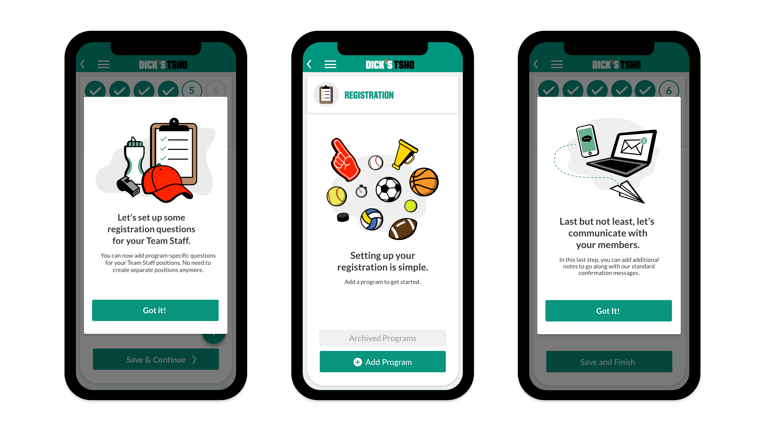
Context screens for mobile.
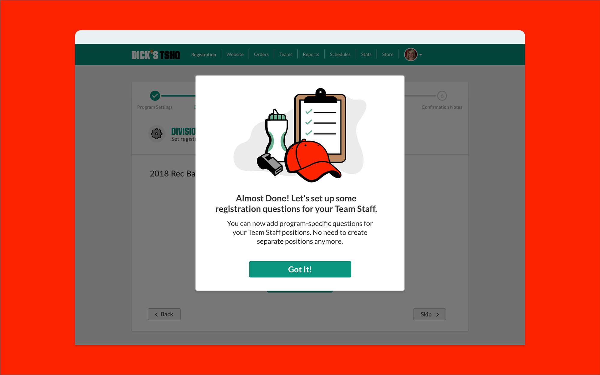
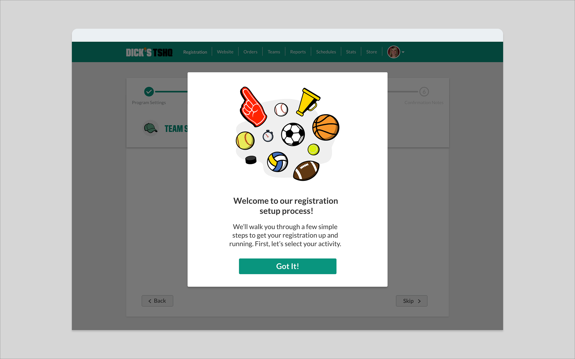
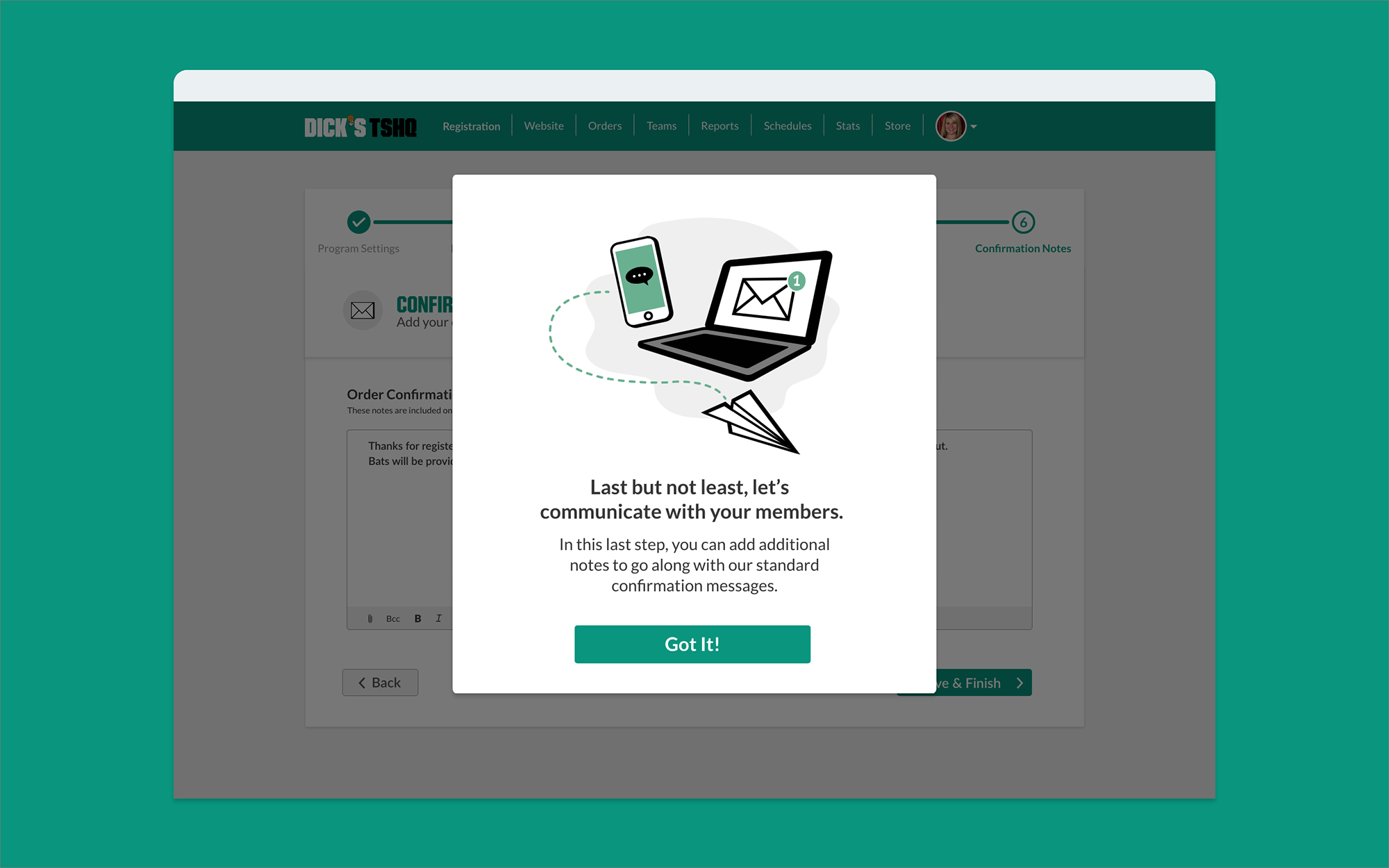
Context screens for desktop.
We introduced empty state screens throughout the registration process to inform users when they had reached a dead end; rather than just leaving them on a blank screen, we offered them a call to action.
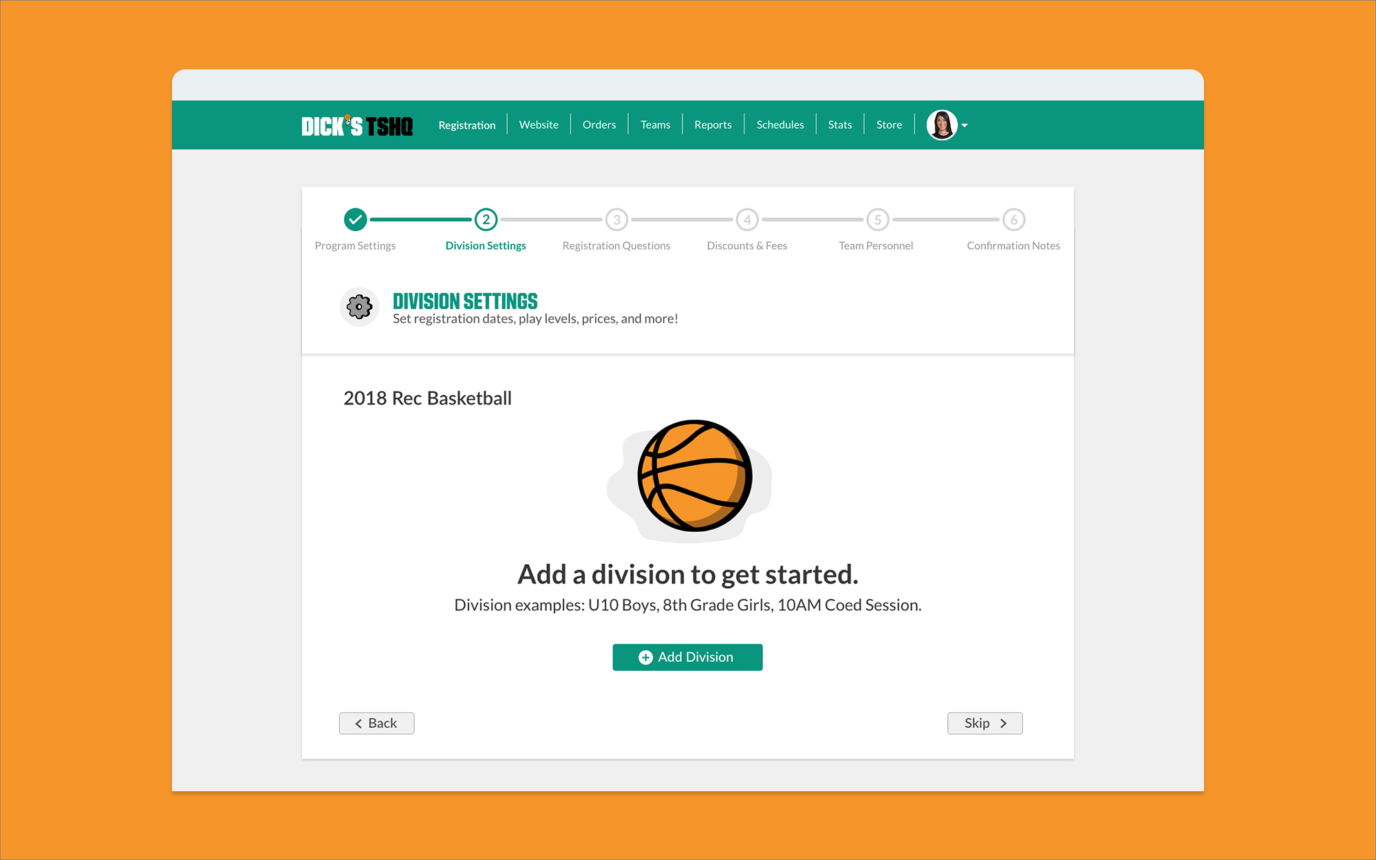
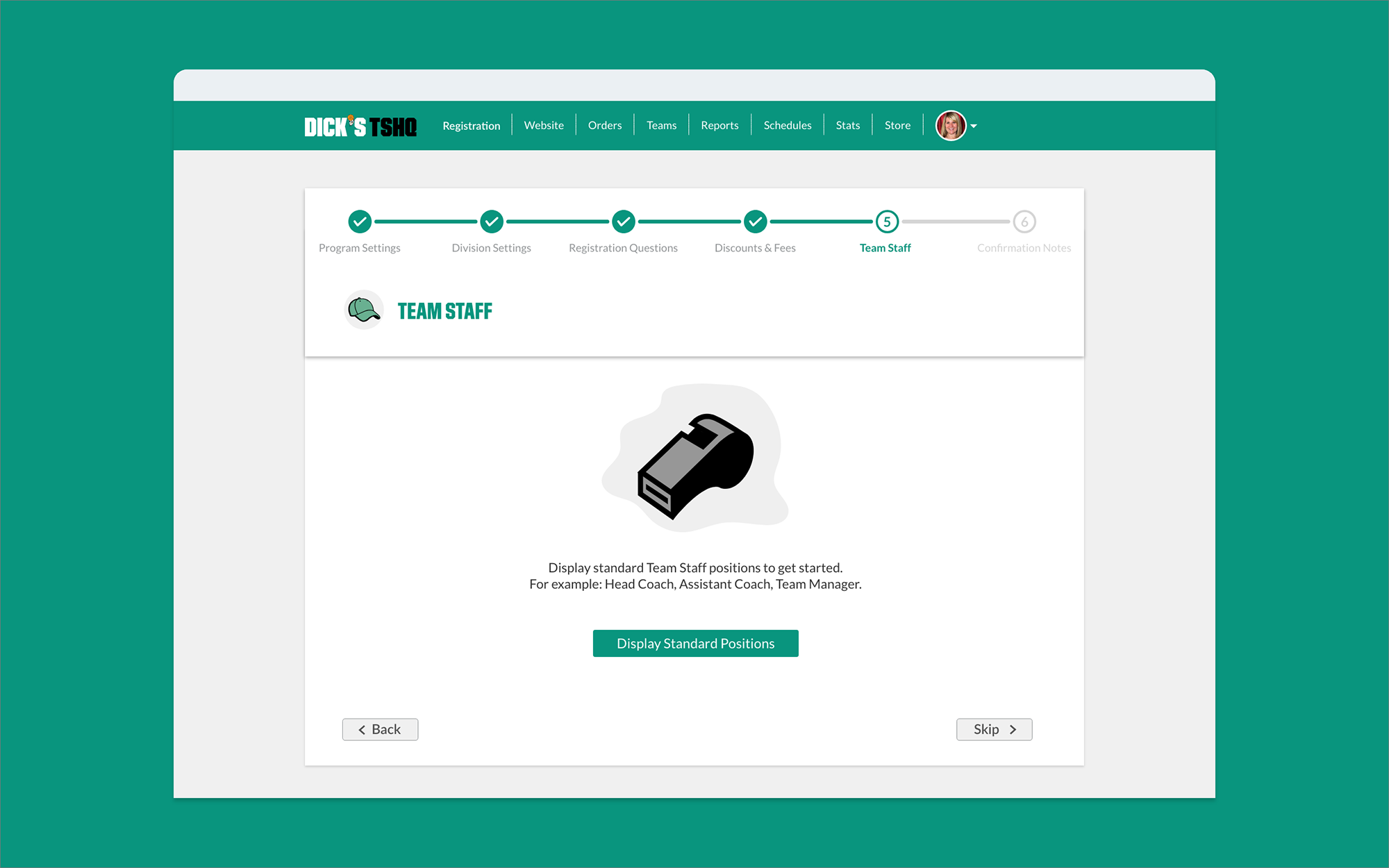
Empty state screens.
Improve Fan Wear Sales
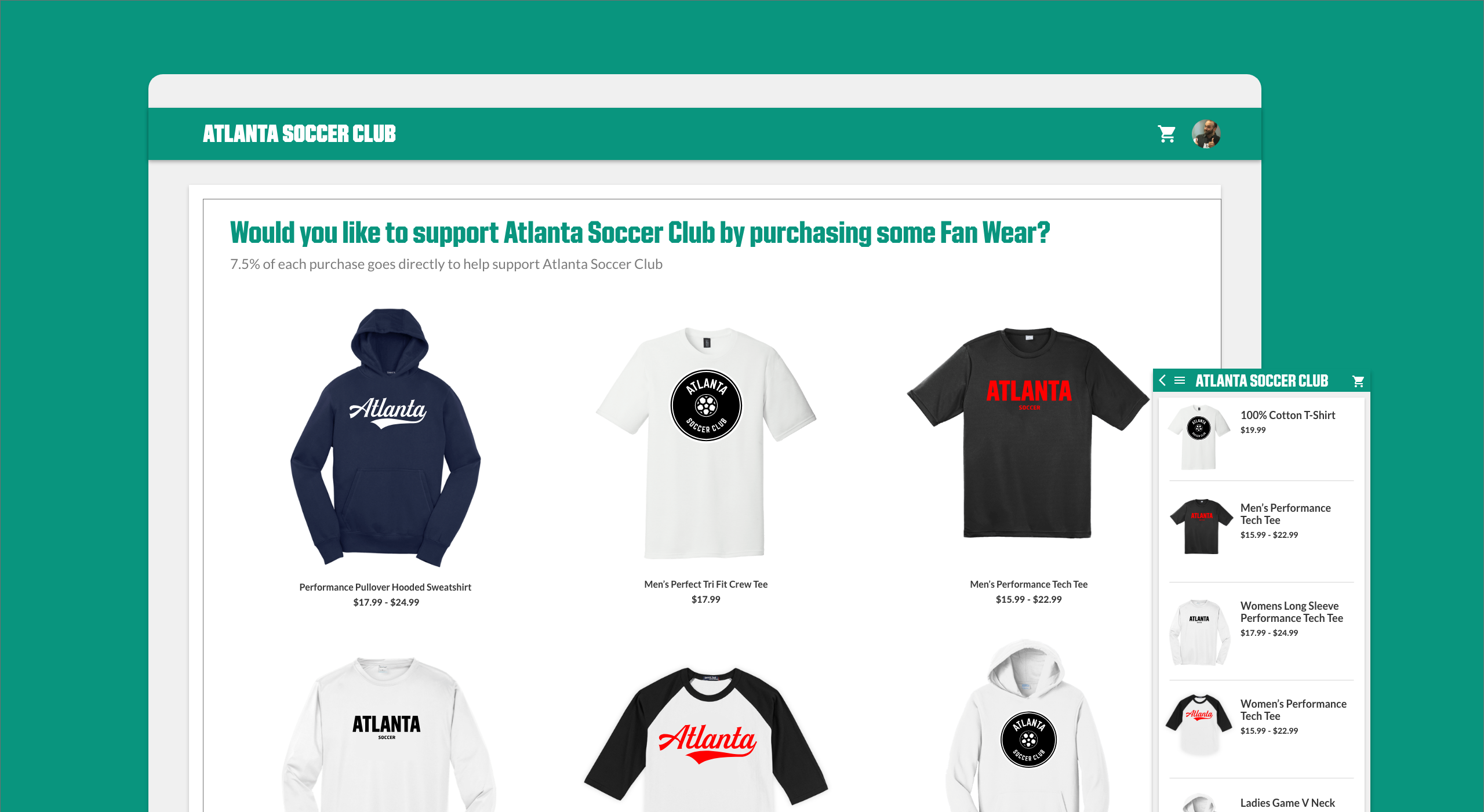
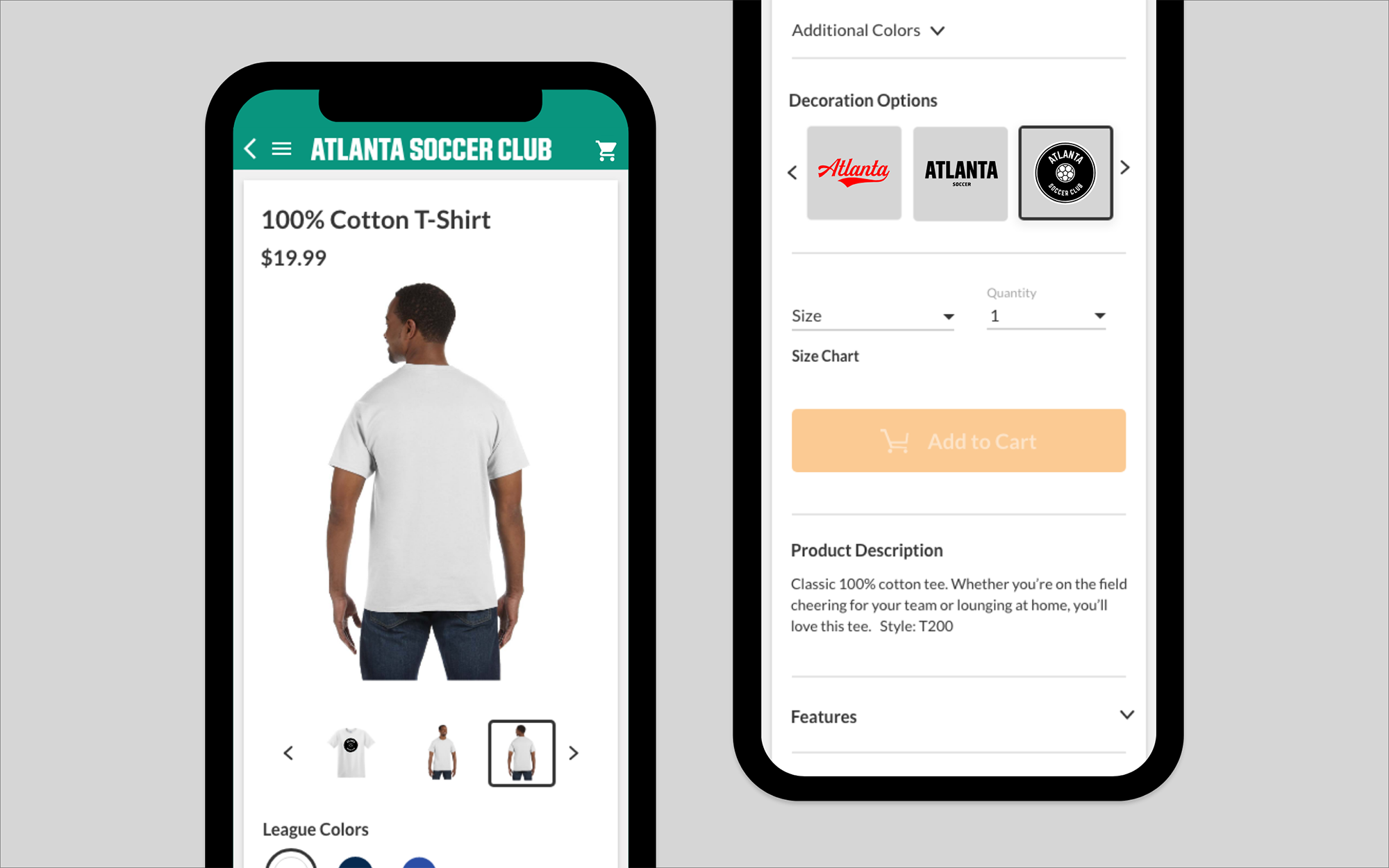
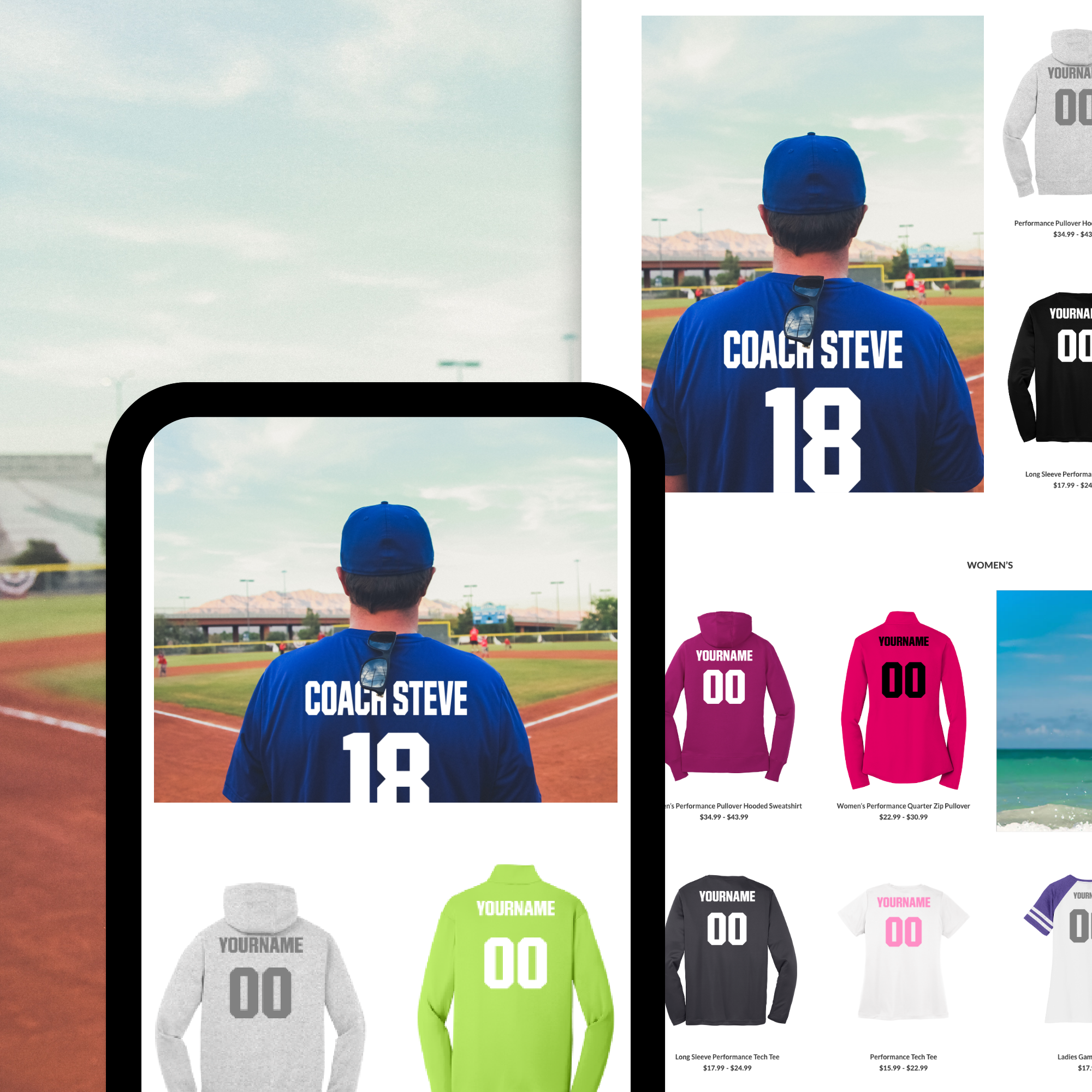
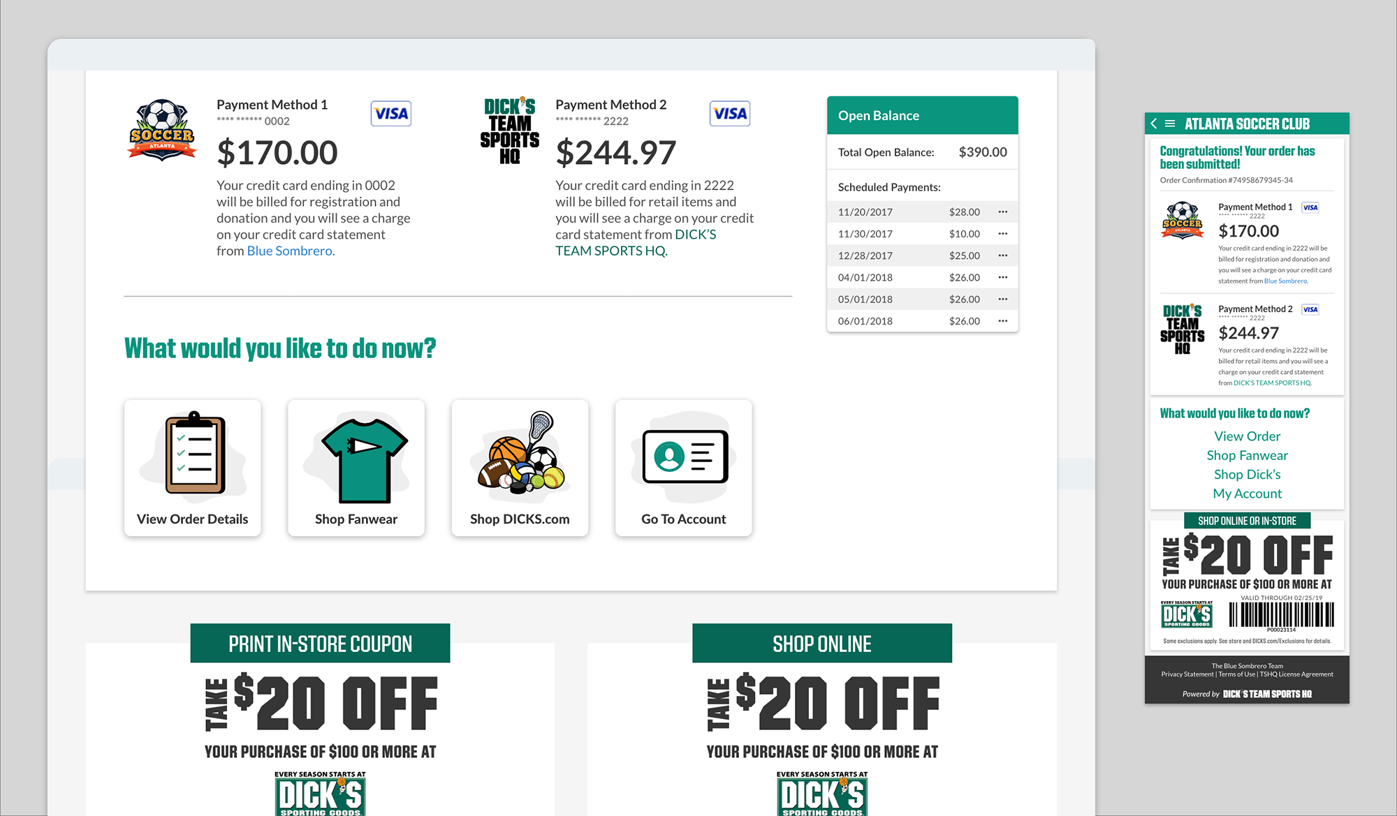
We wanted to include fan wear into the registration to help supplement the already existing standalone store. Adding fan wear into registration had to be an organic and seamless process. It needed to feel like it was another step in the registration. We wanted to treat the fan wear almost like exiting through the gift shop at amusement parks. Our assumption was that if fan wear were included into the process of registration, users will be much more likely to buy something while thinking about the sign up process for the sport, rather than remembering to go back to the store at a later time. The results of our research and testing were showing this assumption to be correct.
