Paradesmith
The primary objective of Paradesmith is to give the user the ability to collect and curate all of the content related to their unique interests. Information today is so readily available, but tough to corral into a single location so one can see it all. The founder of paradesmith reached out to me with an idea for an app that he wanted to make a reality, based off of this principle.
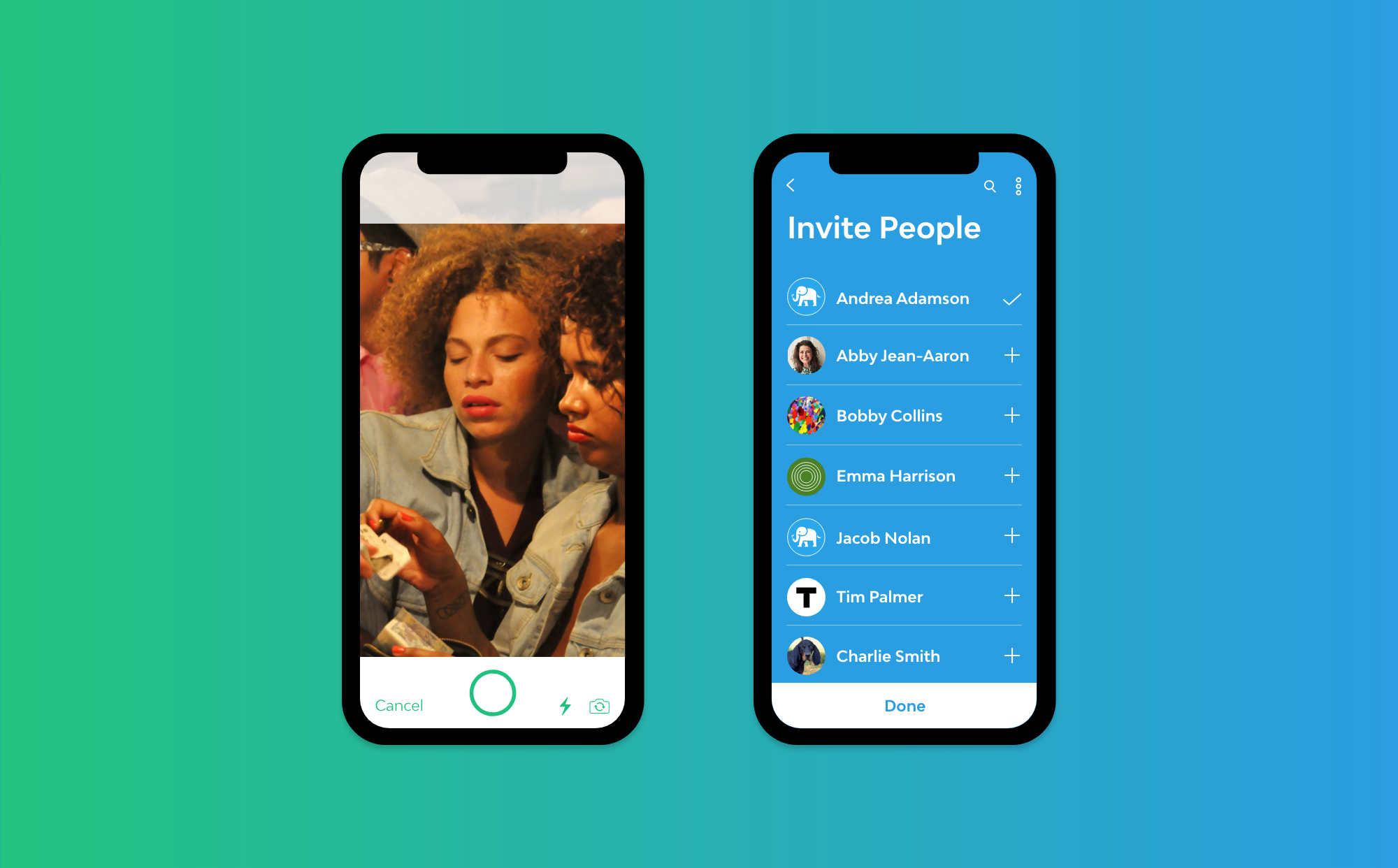
Users can create parades, or repositories, which can be shared with others so that everyone can capture and experience everything going on. In this way paradesmith can build a global community of likeminded people who have a parade topic in common.
Together, we conducted research on the industry, opportunities in the market not well represented, and clarified detailed requirements before beginning with an MVP (Minimum Viable Product) that he could use to help find investors.
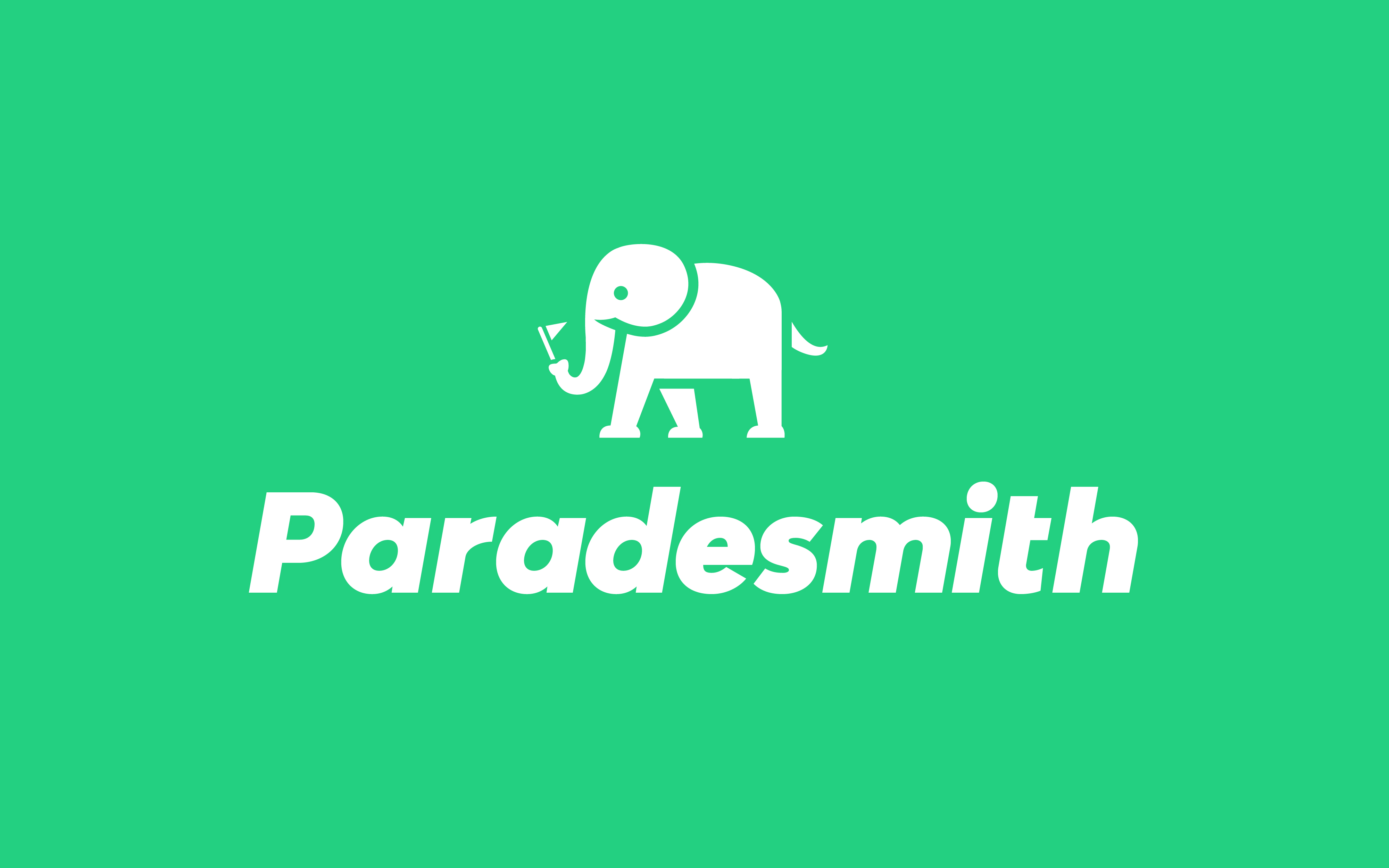
The Logo
We began this journey by working on a logo for paradesmith. An elephant was chosen for because they are sociable, intelligent, and likable animals. They travel and communicate in herds and with other herds. Elephants follow one another in a single file line, similar to a parade procession. The adage "an elephant never forgets" represents paradesmith perfectly as it is a repository for all of your photos and videos and events, even if you've forgotten them.
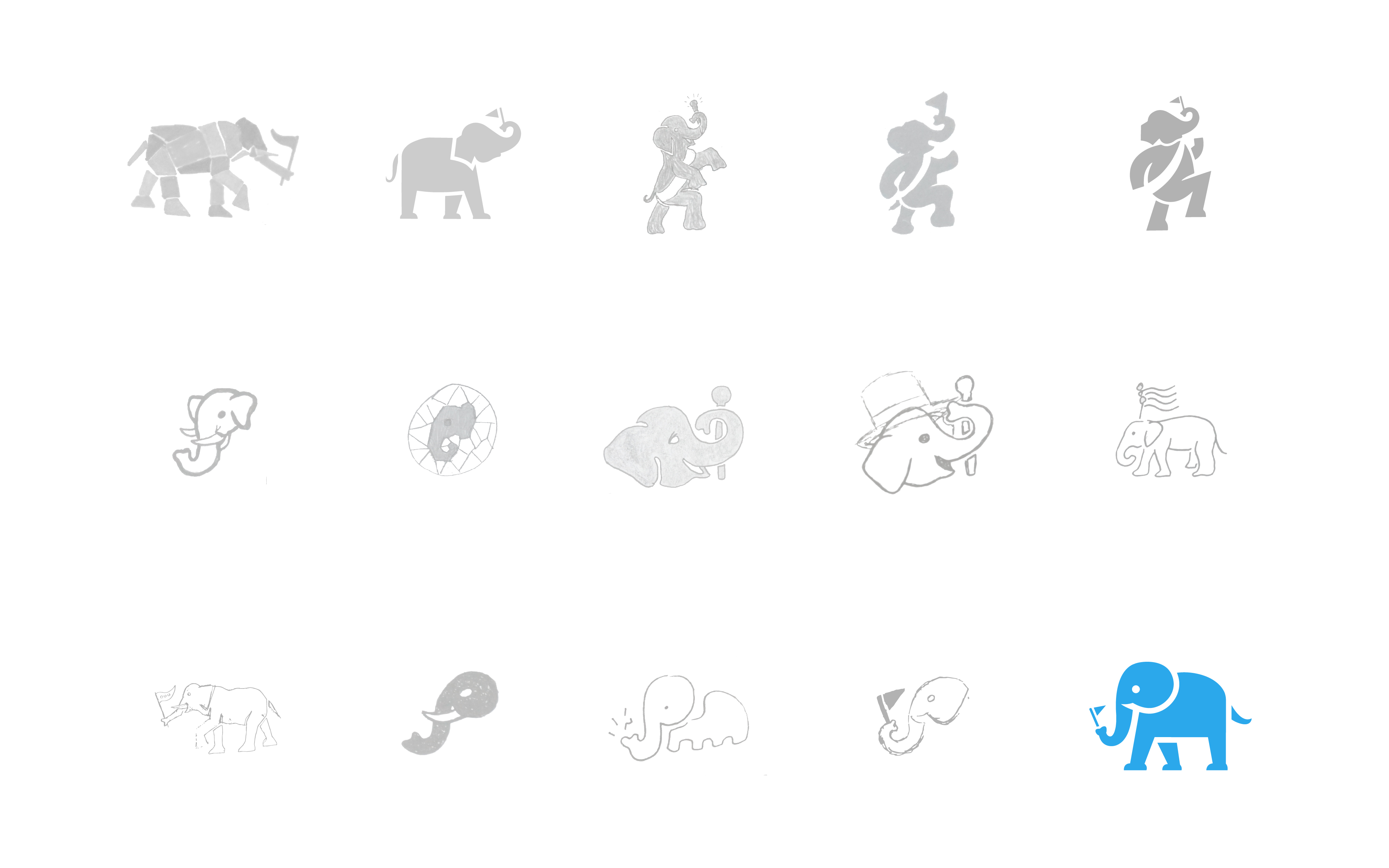
Logo exploration
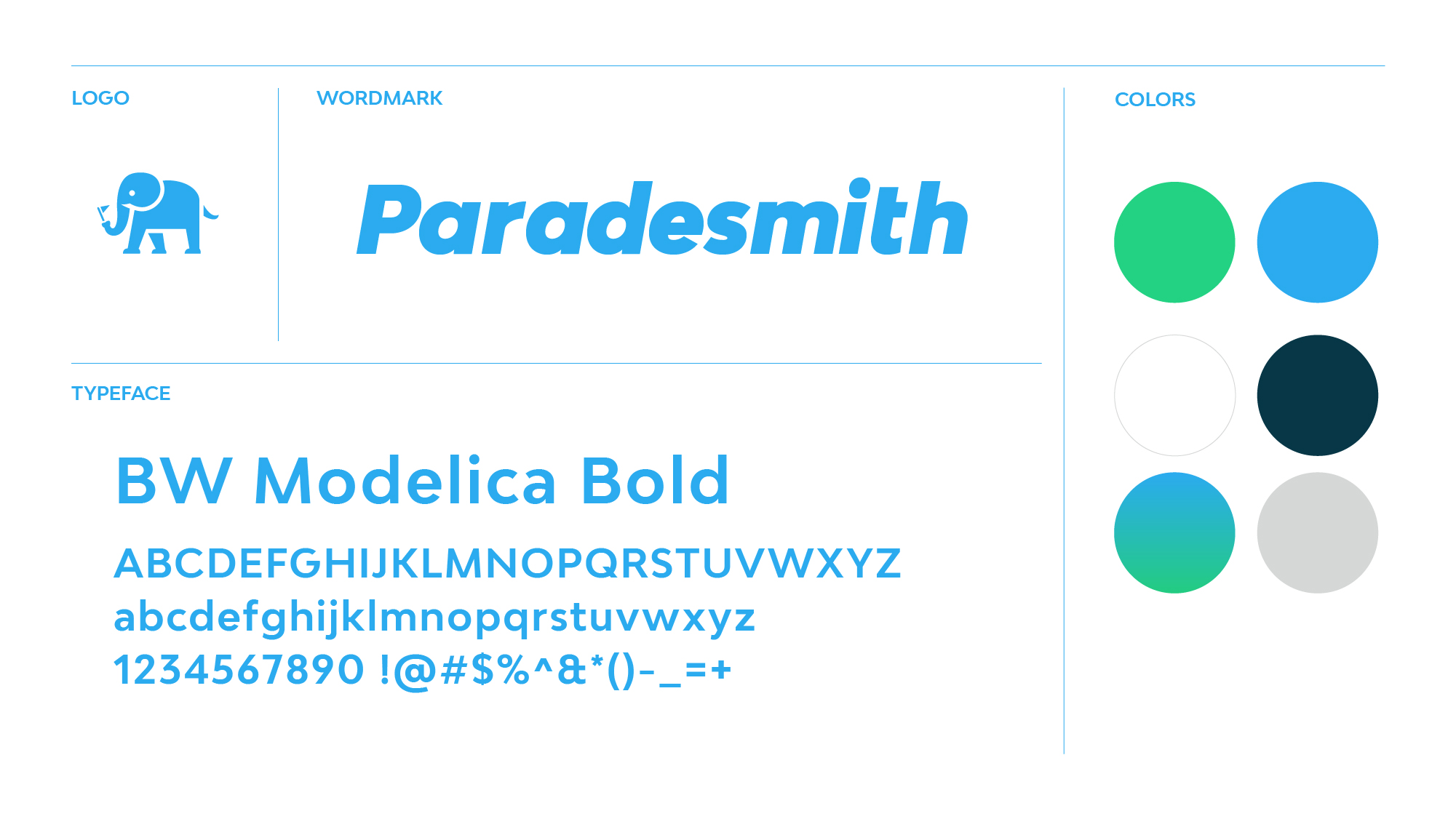
Styleguide
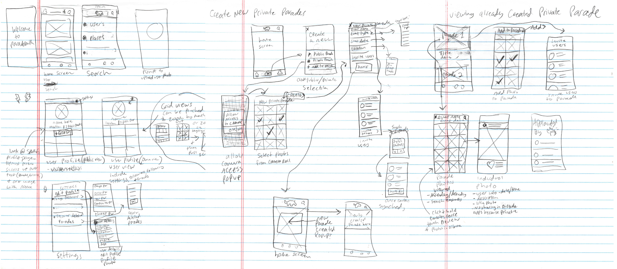
After a clear direction for the brand was established for the style of the brand, the design for the app was expanded through the use of personas based off of initial research. From data in the personas, mood boards and style tiles were created to help define the look and feel of the app. Sketches were then made to help outline the app visually and to get all the information into one place.
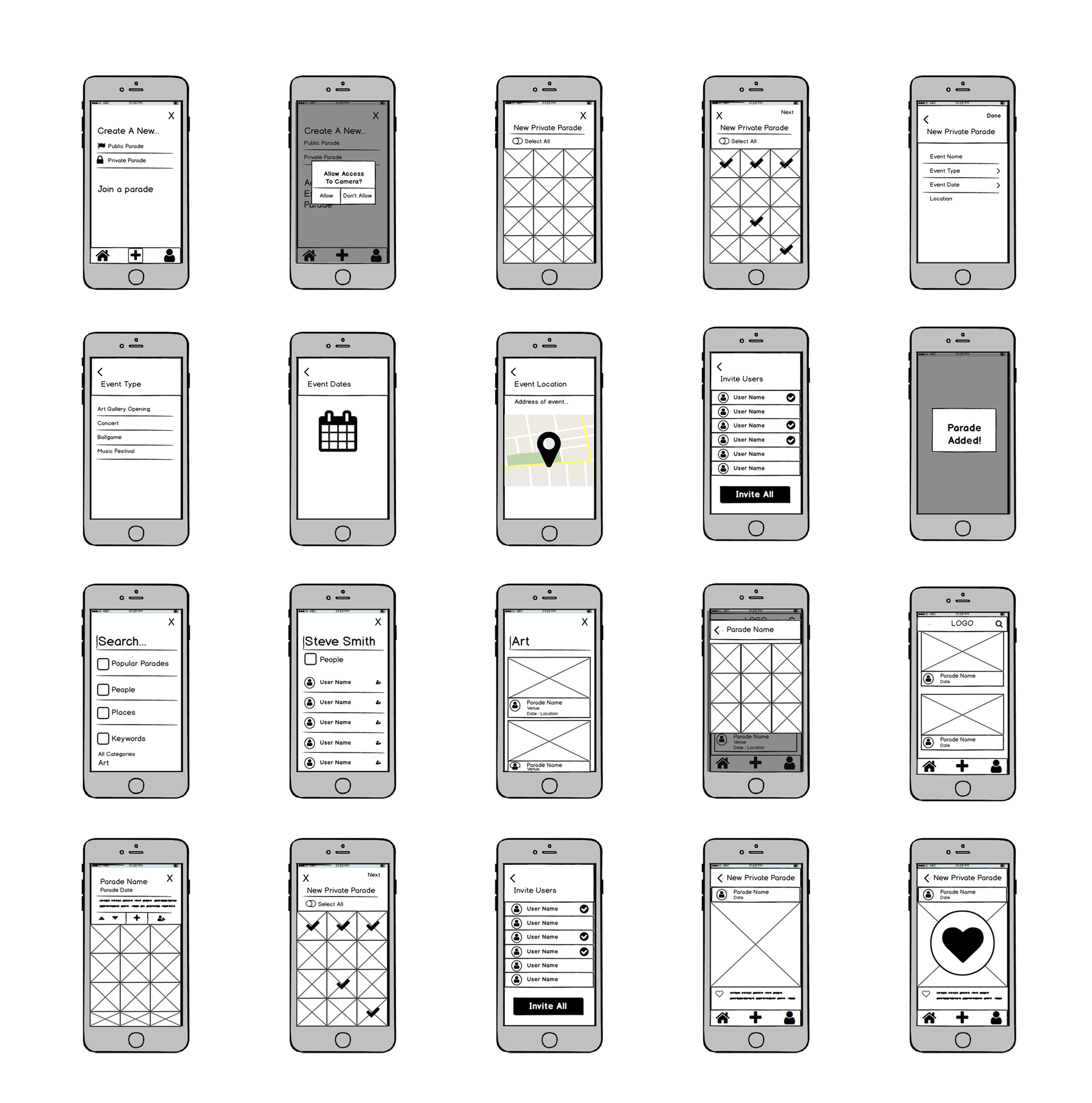
Wireframes were developed from my initial sketches and helped me to arrange interface elements and to focus on the functionality and requirements of all the screens in the app without worrying as much about how everything was going to look.
After several iterations and a simple prototype to test the main functionality, I moved on to the high fidelity designs.
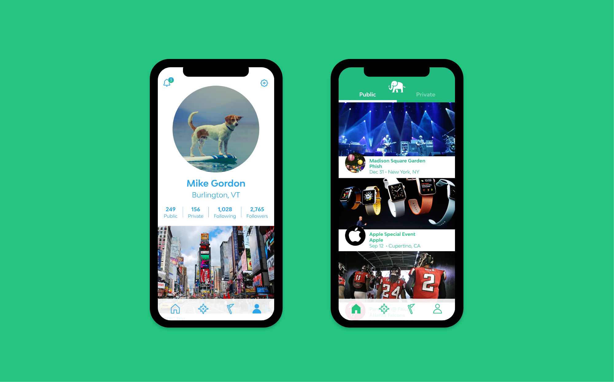
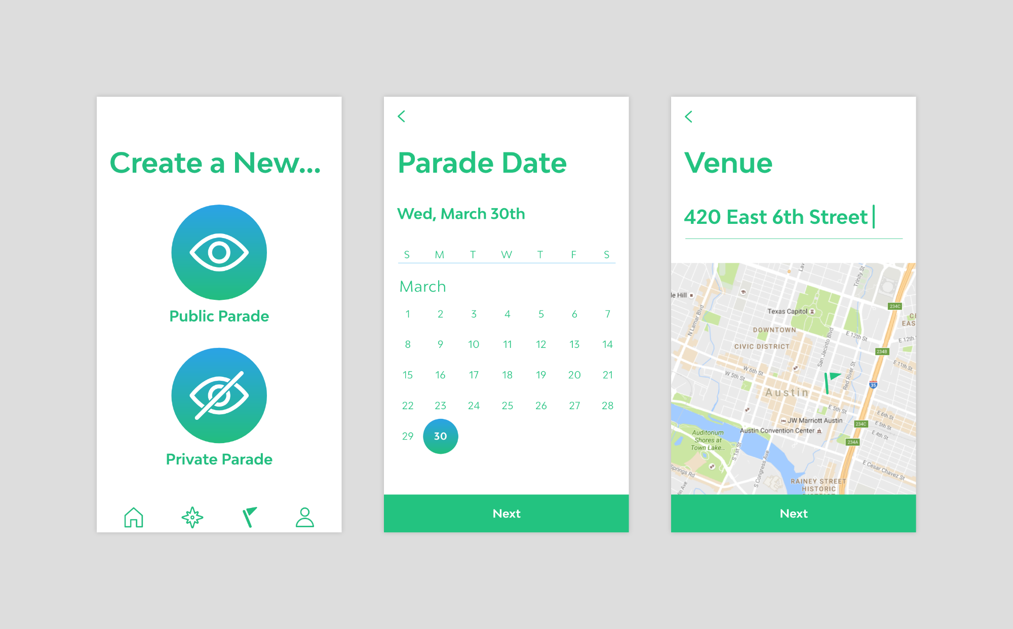
The explore tab lets users discover new things in paradesmith.
Instead of a "like", thumbs up, or heart to show your appreciation for a photo you enjoy, "applause" was the action used.
Photos inside of a parade can be viewed from full sized, to the breakdown of time when the photos were taken.
R.I.P. Paradesmith 🪦