DICK'S TSHQ
Registration Redesign
DICK'S Team Sports Headquarters powers registration for 3 million players across 10,000+ team websites. Years of bolted-on features had left the experience fragmented and confusing: it needed a comprehensive redesign.
Previous TSHQ registration UI.
The Challenge
Each year brought new features with little regard for the product as a whole. The result: an incoherent UI, a frustrating user experience, and a system overdue for a complete overhaul.
Research
We interviewed administrators, governing bodies, parents, and coaches, and built personas for each stakeholder group. Customer support data confirmed what users were telling us: the problems were widespread.
Based on research data and interviews, we identified current issues with the product, user needs, and business goals. We formed assumptions for how best to solve our biggest challenges.
Assumptions
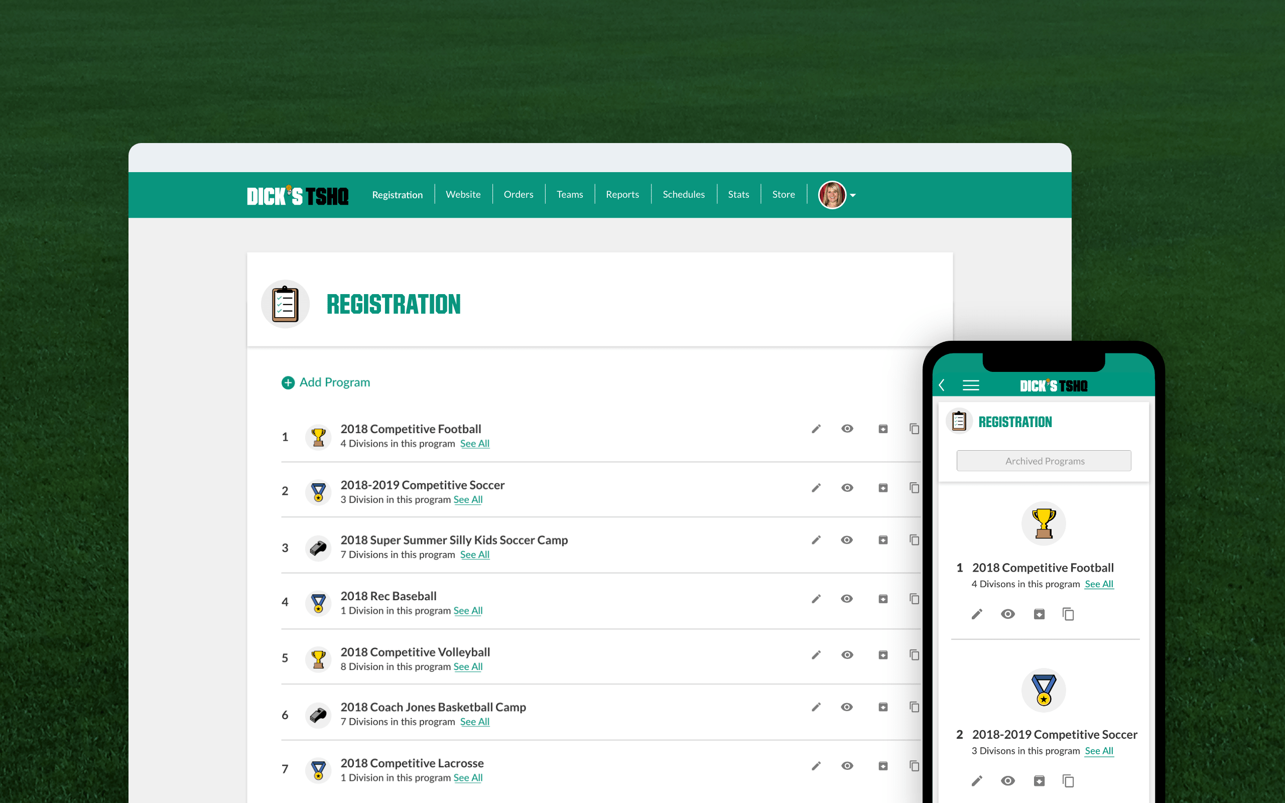
Mobile Experience
The legacy mobile experience predated smartphones — and showed it. With an 88% mobile abandonment rate (vs. 18% on desktop), a mobile-first redesign was the clearest opportunity to recover lost registrations.
Improving the user experience for mobile devices will decrease the abandonment rates for mobile and will greatly increase our overall registrations completed from mobile devices.
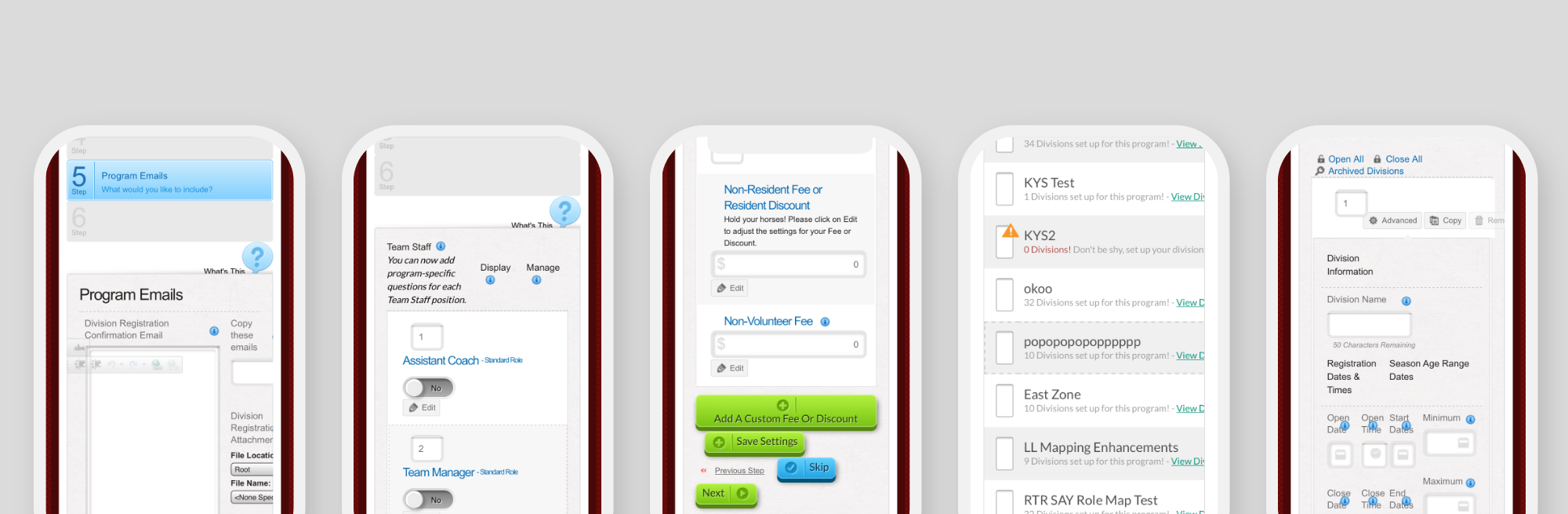
Previous TSHQ mobile UI.
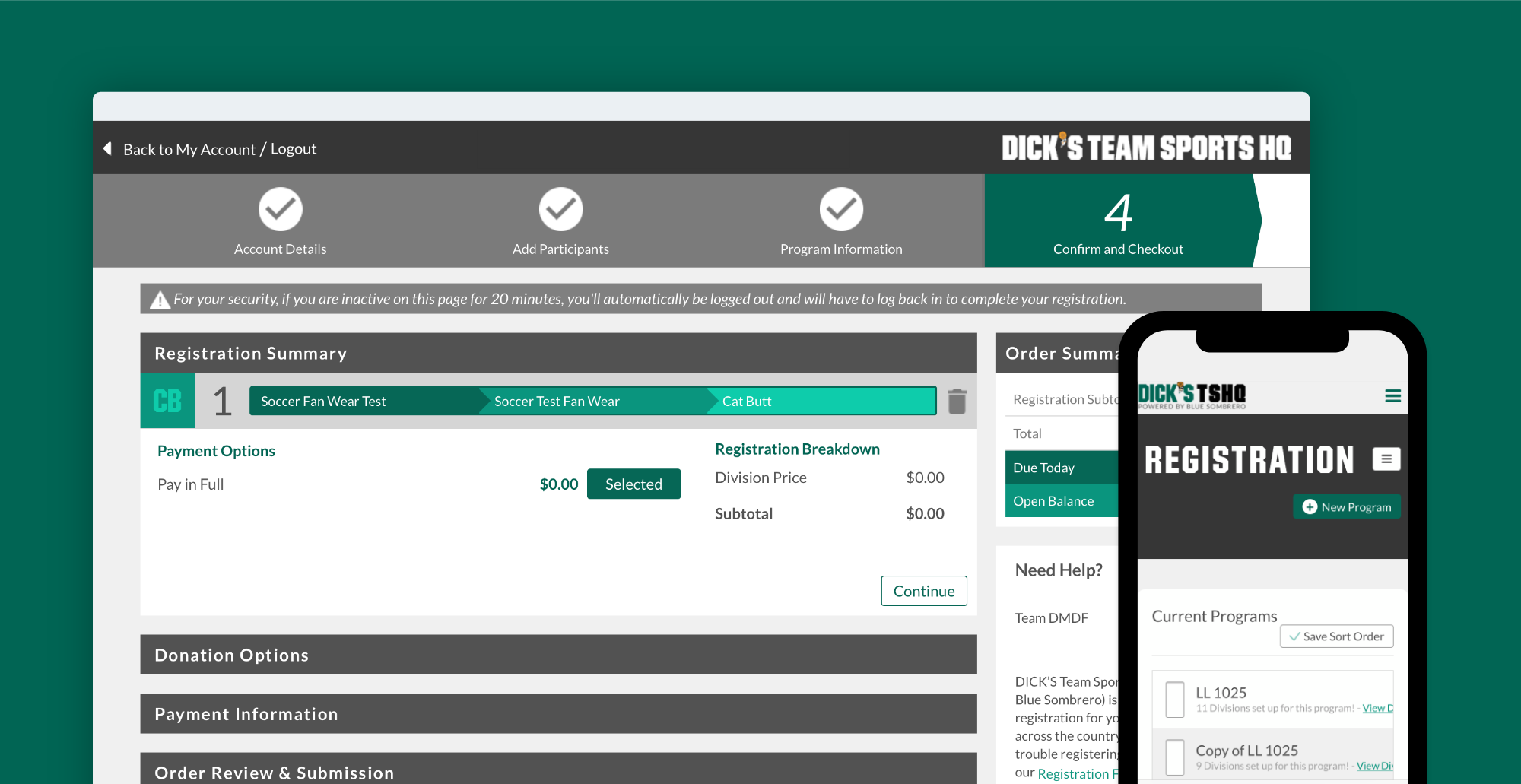
Guiding the User
Registration issues drove 45% of all support calls annually. Users didn't know what they were supposed to do or why. Contextual guidance — surfaced at the right moment, not buried in text — was the fix.
Giving users a greater sense of context by instructing them on tasks with less text to read, and leading them with prompts to begin a task, will reduce confusion and reduce the frequency of calls to our support team.
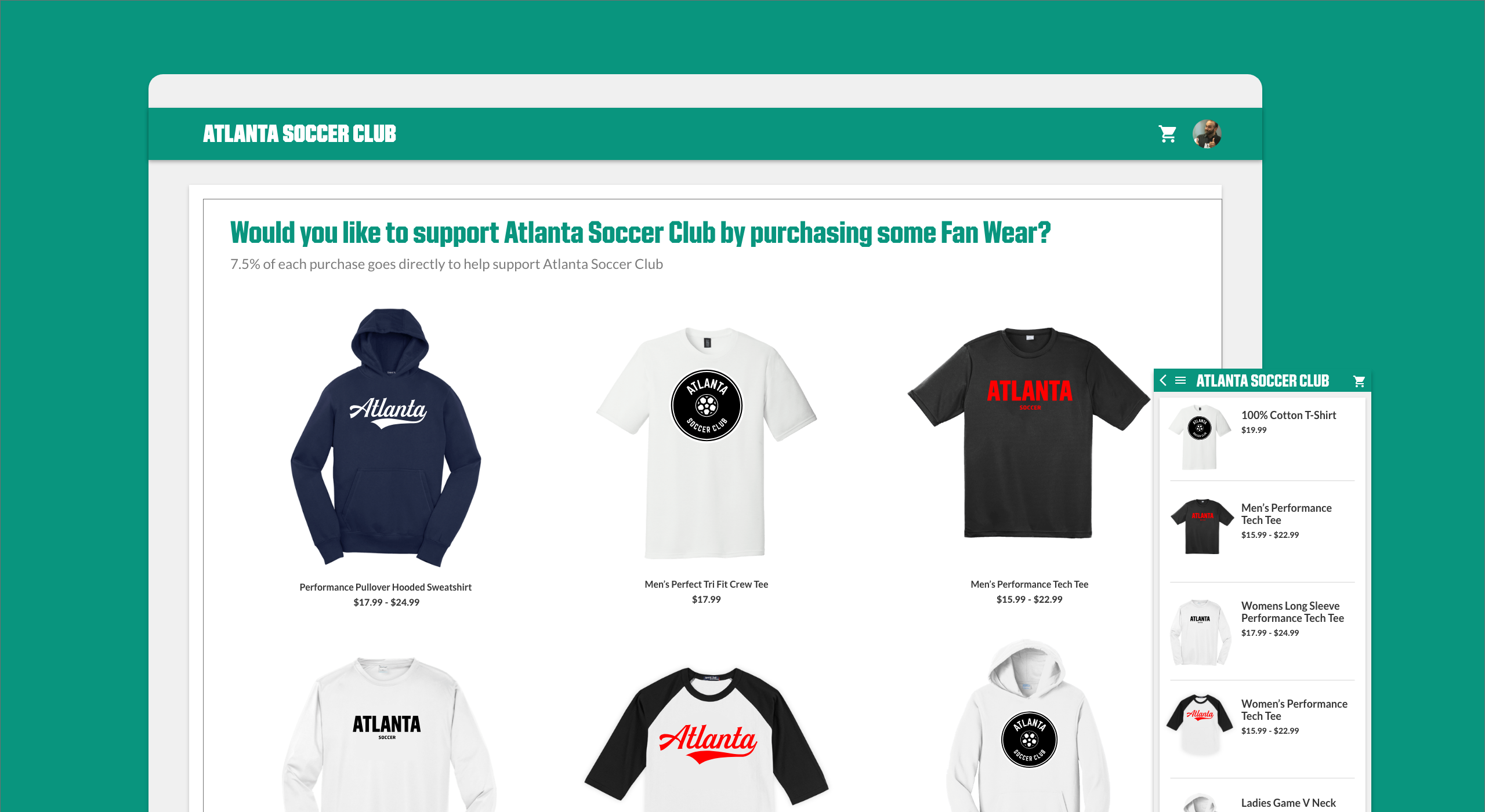
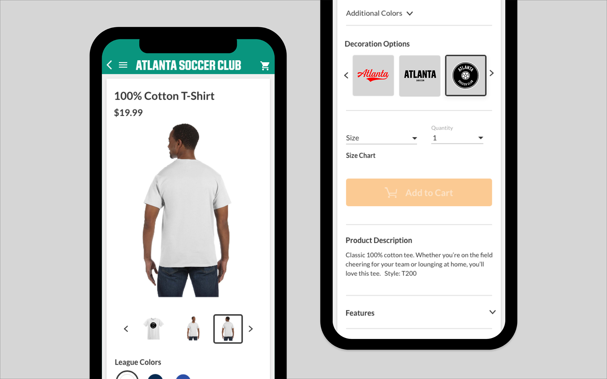
Improve Fan Wear Sales
The fan wear store was an afterthought: hard to find, low-trust UI. Embedding it directly into the registration flow would surface it to the right audience at the right moment.
Including fan wear into the registration process will greatly increase our sales of fan wear merchandise and reduce friction of the experience.
Process Before Design Work
Before any pixels, we audited every screen through affinity mapping, restructured the information architecture, developed wireframes, and pressure-tested feasibility with the dev team.
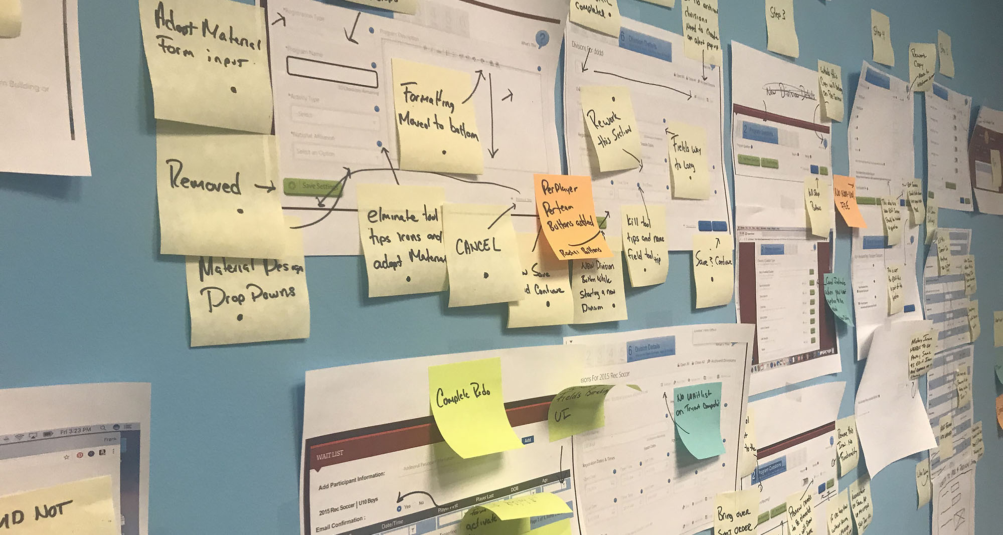
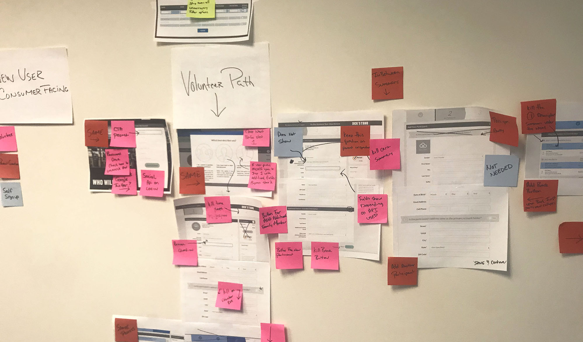
With unnecessary steps removed, we refined the information architecture and built wireframes, with each screen's requirements clearly defined.
Refined IA.
Lo-fi designs.
Testing and Validating Assumptions
Validation spanned A/B tests, user interviews, prototype walkthroughs, surveys, and guerrilla testing at DICK'S retail locations.
Prototype screen in Adobe XD.
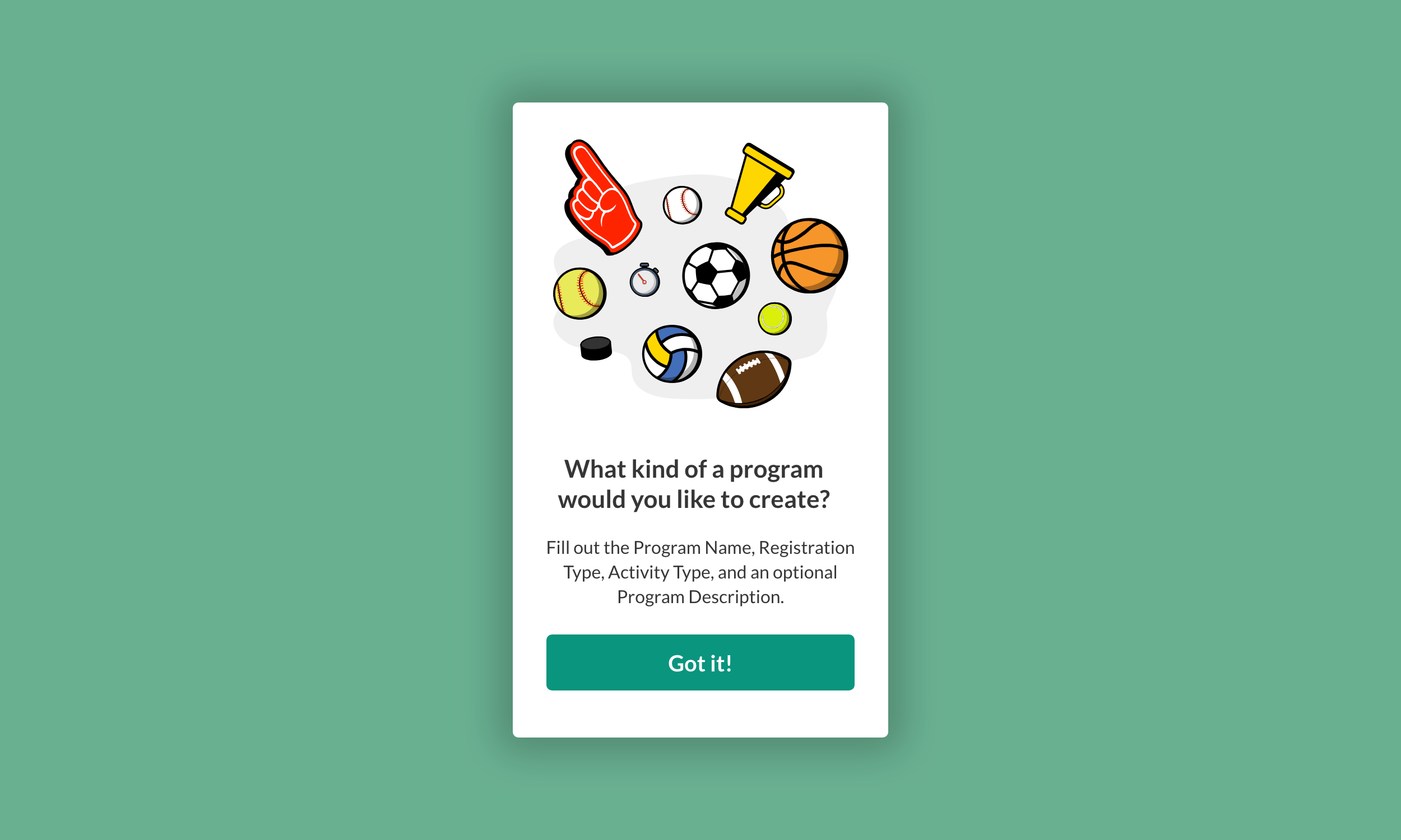
Art Direction and Style
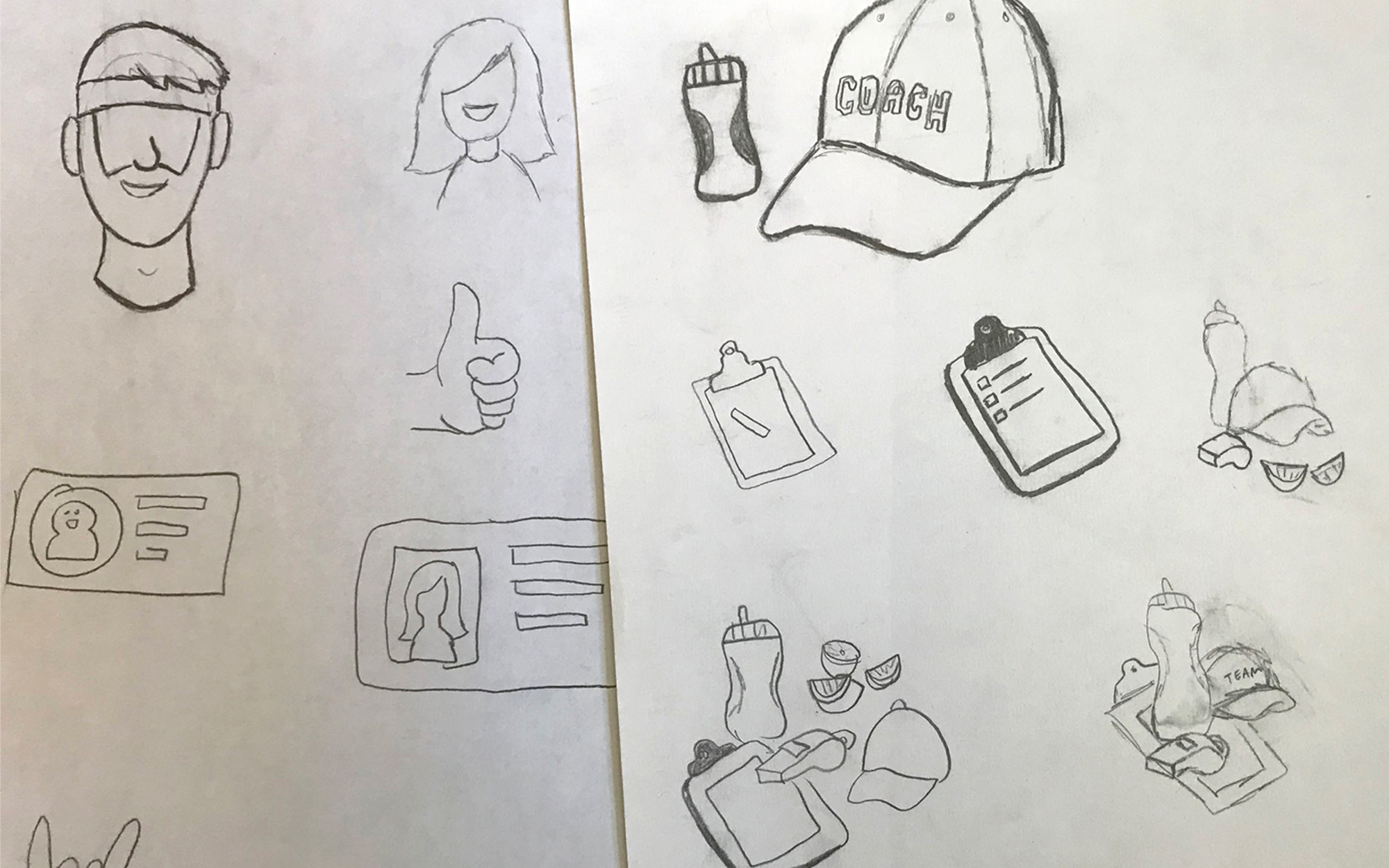
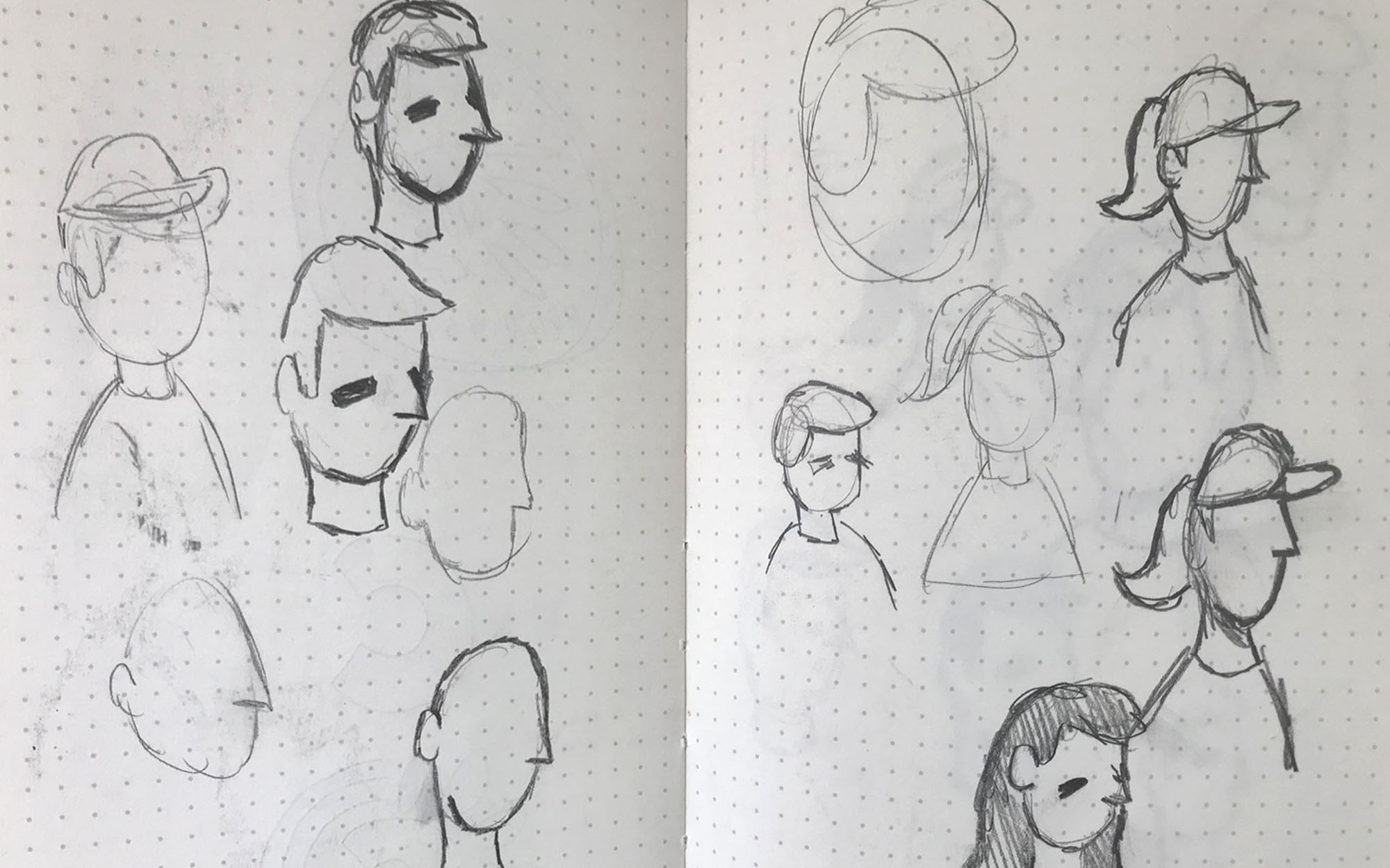
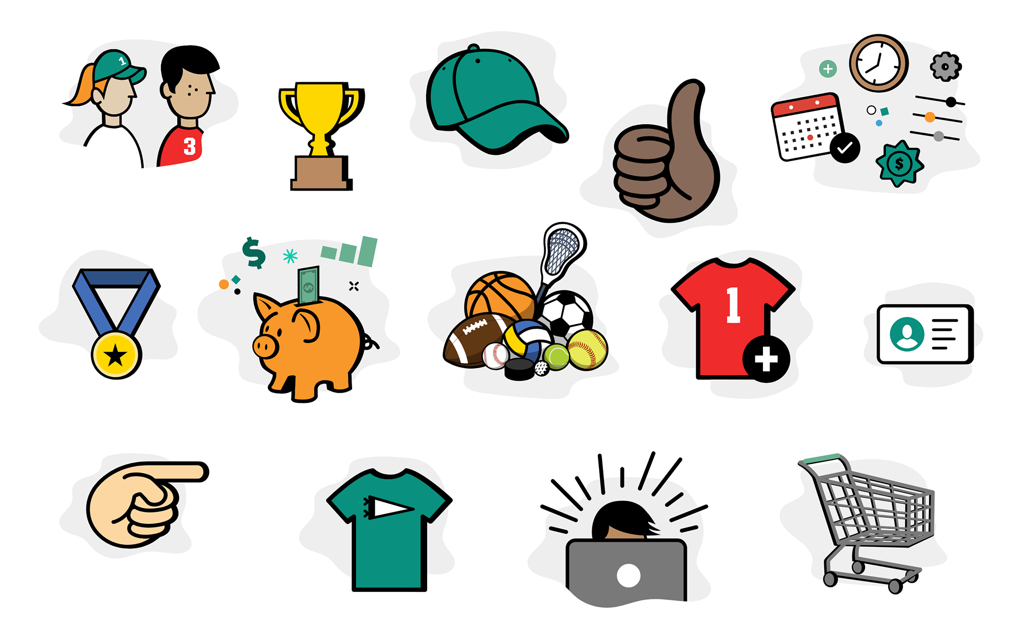
We adapted Google Material Design as a foundation, then pushed past it: custom components, an original illustration system featuring sport characters, and a shared design language built collaboratively across the team.
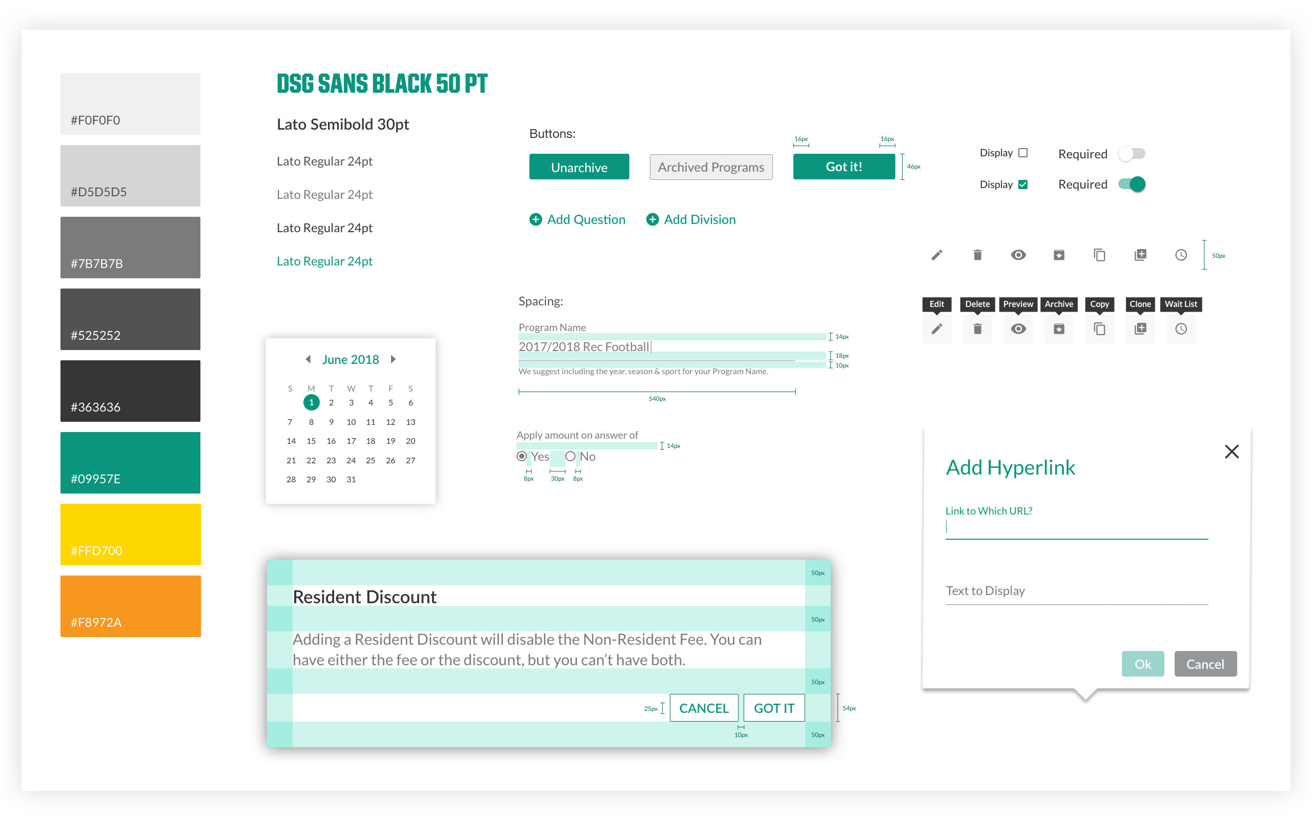
Style guide.
The illustration system was designed to bring warmth to an otherwise form-heavy process — sport characters injected personality at every step.
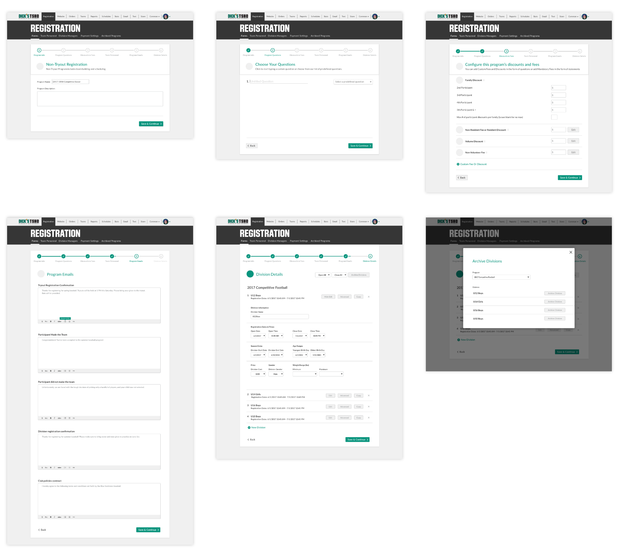
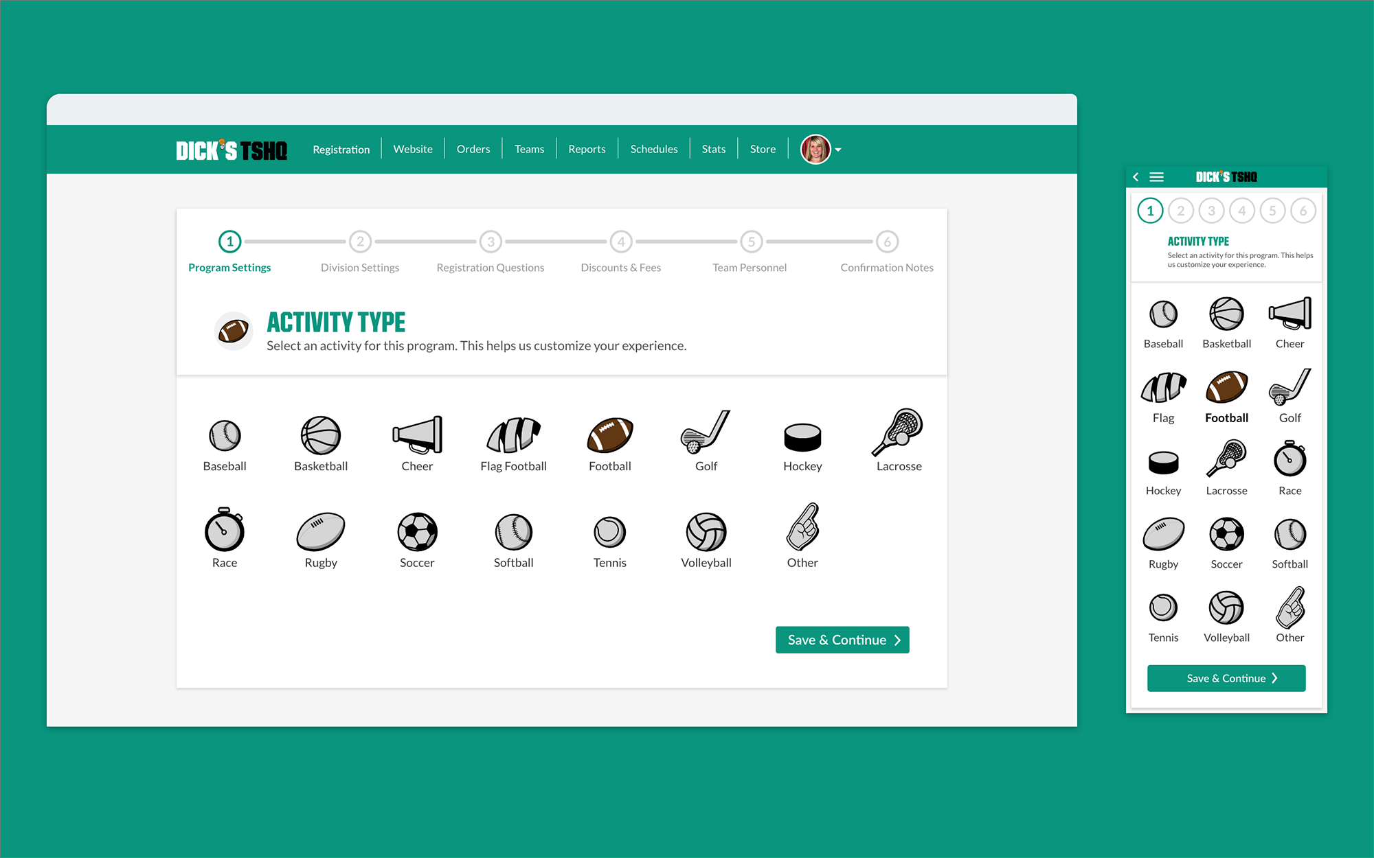
Once stakeholders signed off on the art direction, full-fidelity screens were built across all 6 registration steps — split evenly between myself and a teammate, covering both mobile and desktop.
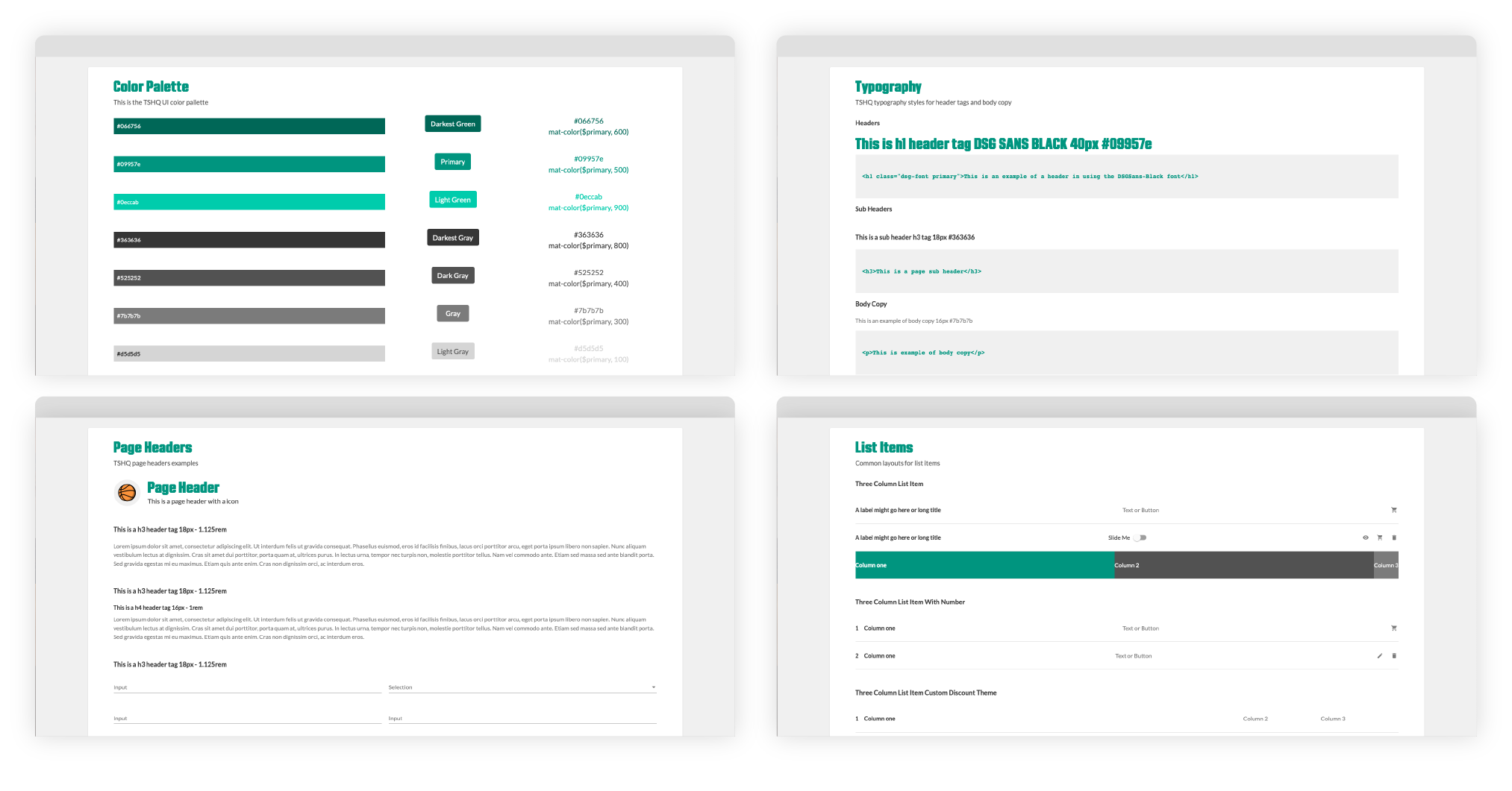
Design System
Working directly with developers, we defined type scales, button dimensions, spacing, and color to create a shared framework that cut ambiguity and accelerated QA.
Design Solutions
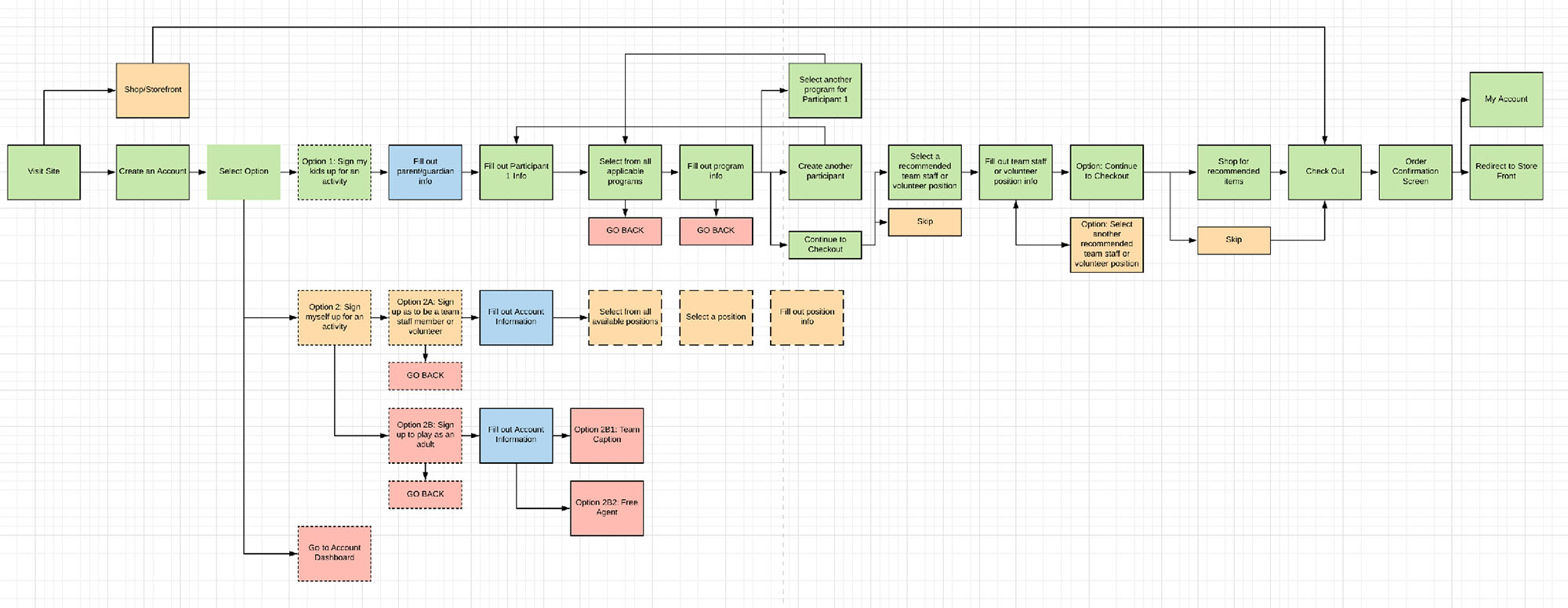
Solving the Assumptions: Mobile Experience
A mobile-first rebuild consolidated the fragmented flow into a clear, step-by-step experience built for the screen people were actually using.
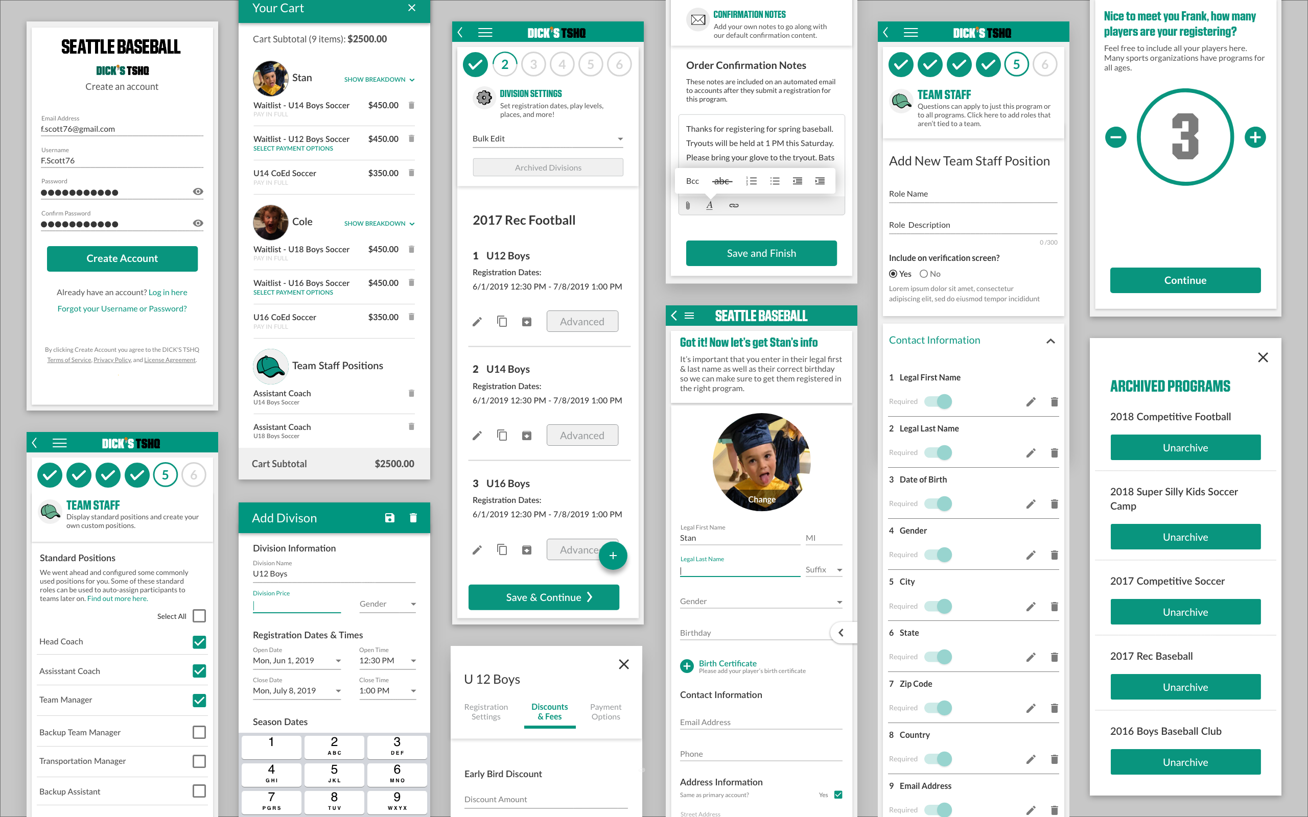
Mobile screens.
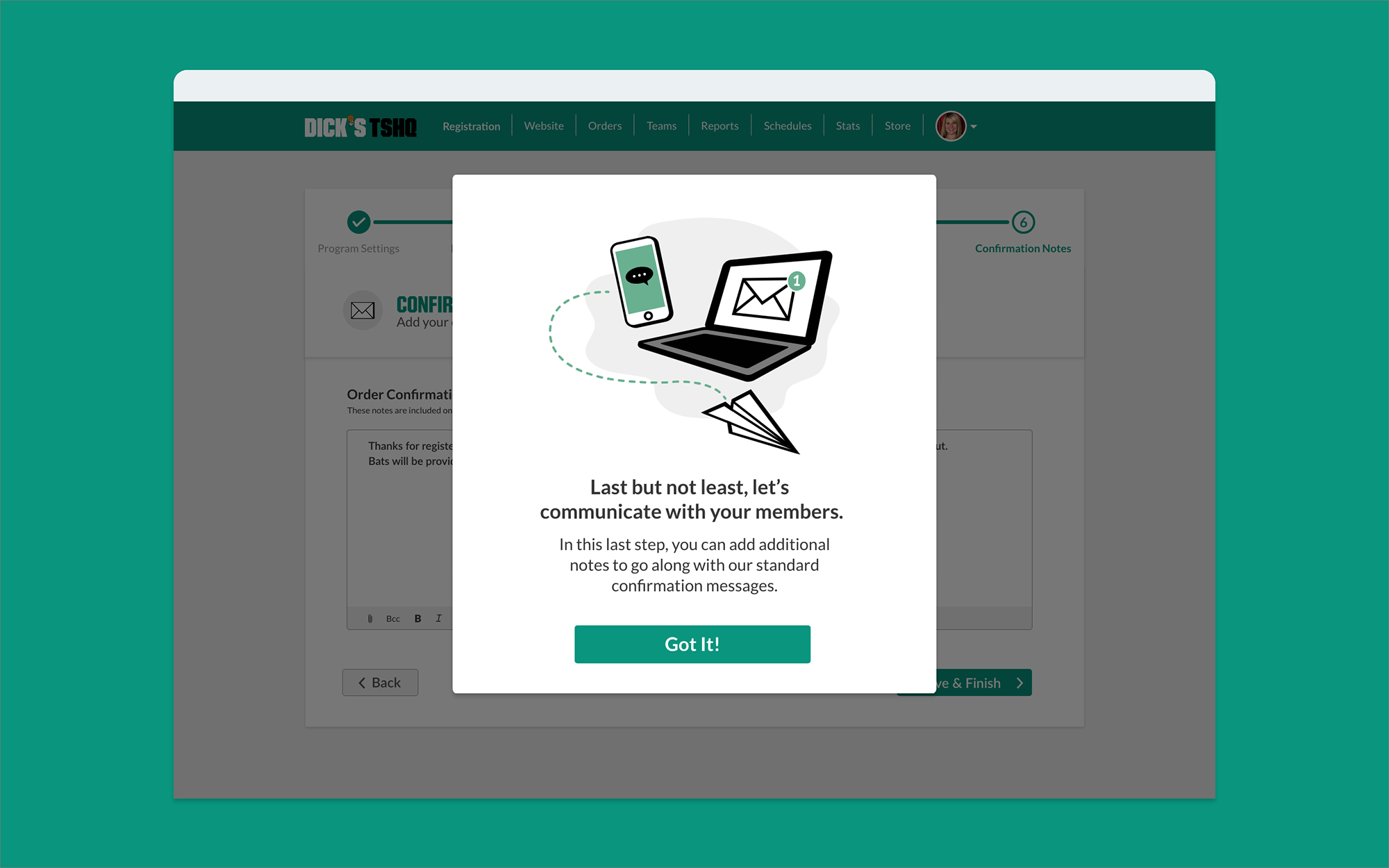
Guide the User
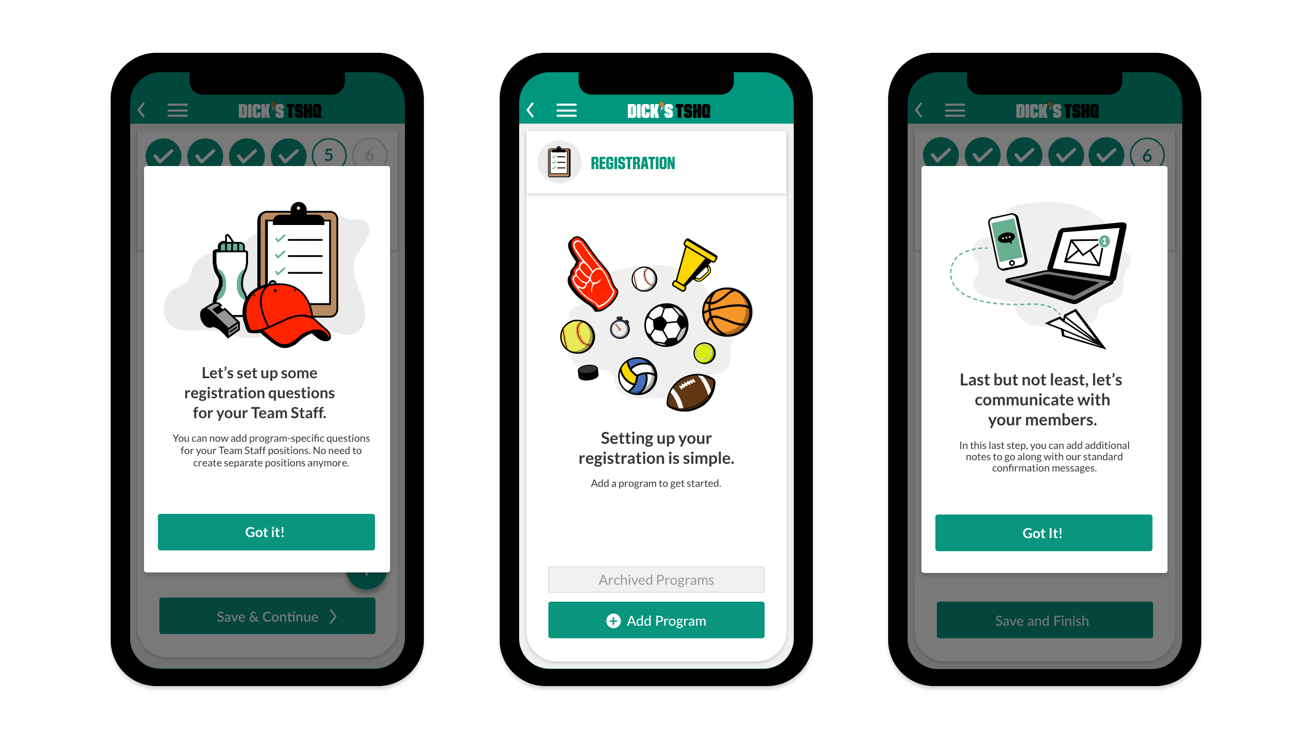
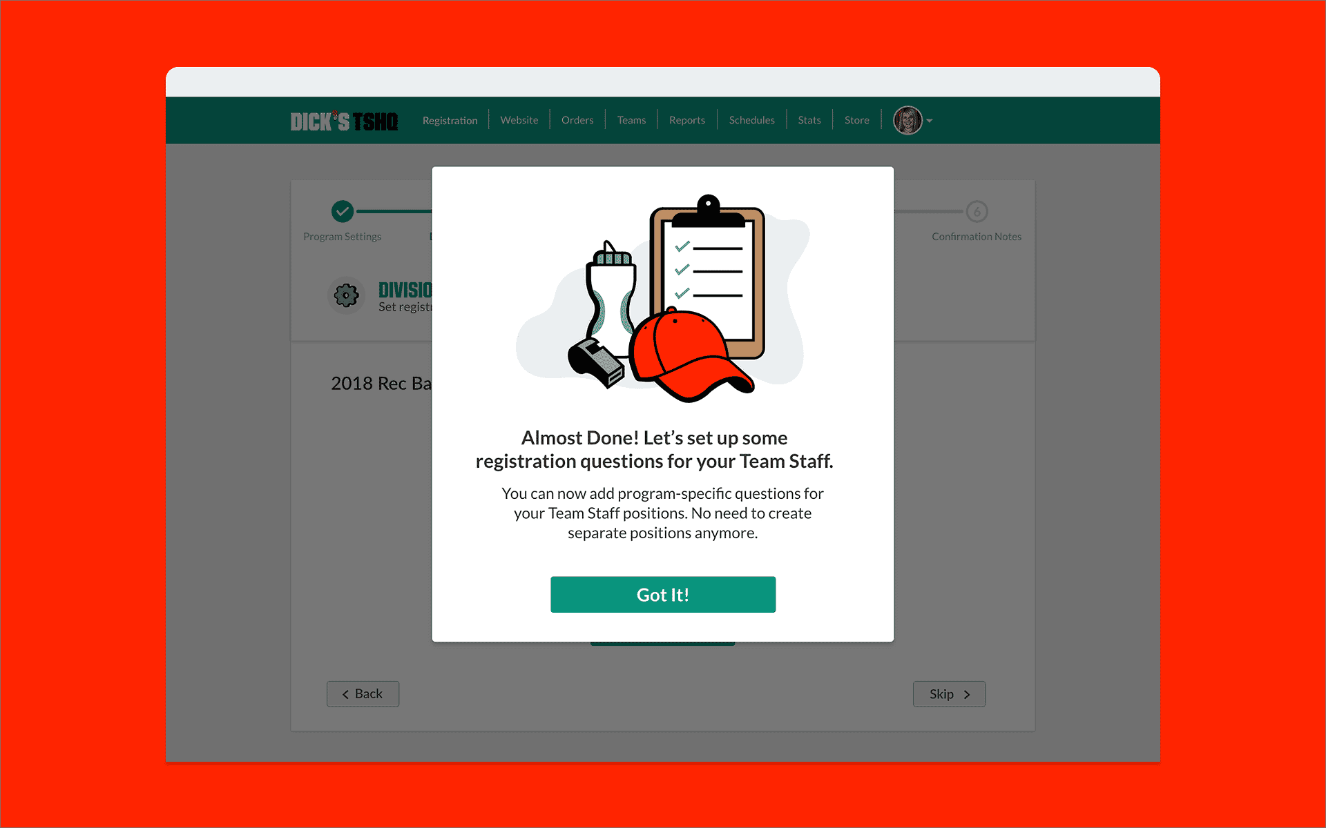
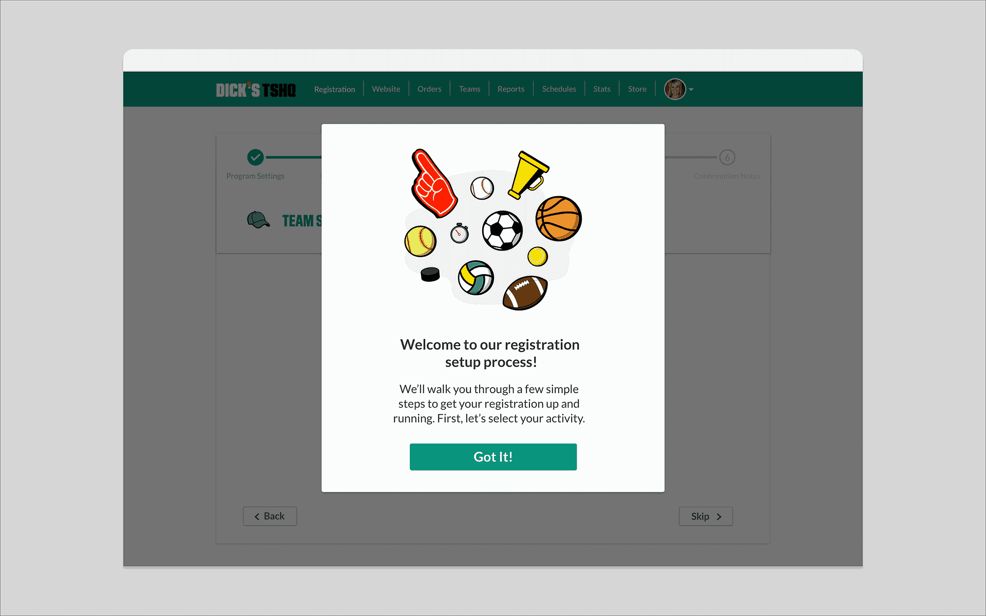
We replaced wall-of-text instructions with a conversational UI: brief context screens between steps, empty states with clear calls-to-action, shown only on a user's first registration, then out of the way.
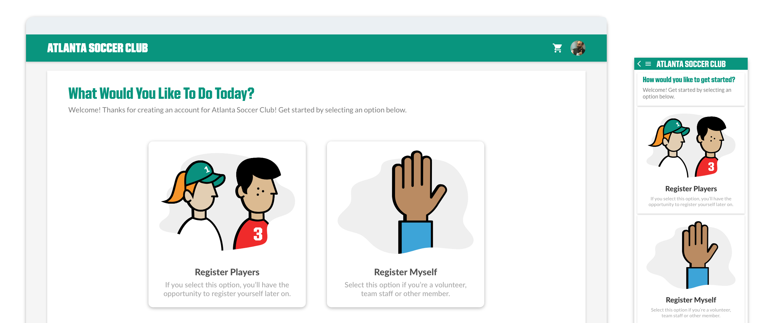
A conversational UI gave users a clear path forward at every step, reducing second-guessing and support escalations.
Between each of the 6 steps, a brief "context screen" oriented users on what came next. These appeared only on a user's first registration — familiar users moved through without interruption.
Context screens for mobile.
Context screens for desktop.
Dead ends got empty state screens with clear calls-to-action, so users always had a next step instead of a blank wall.
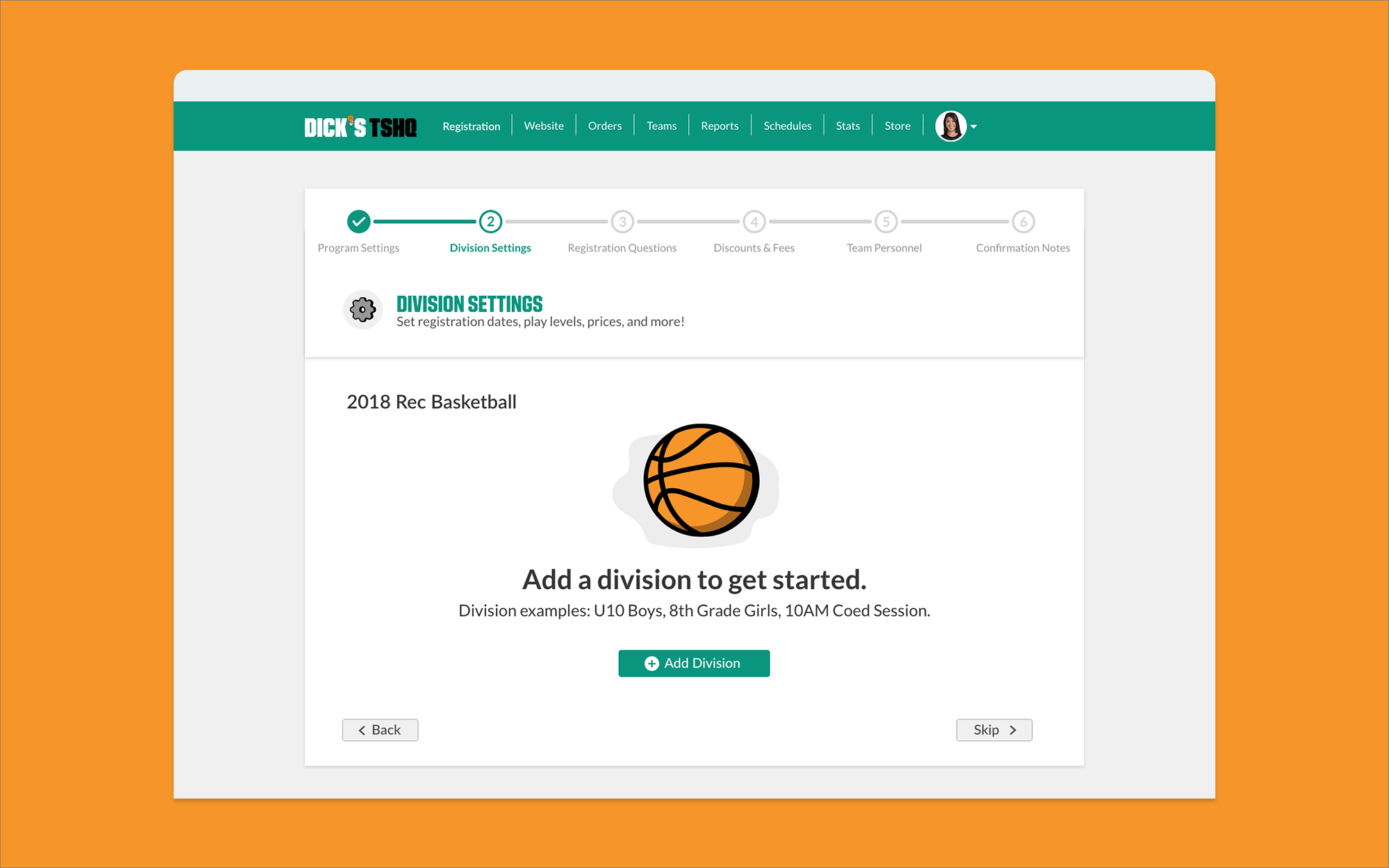
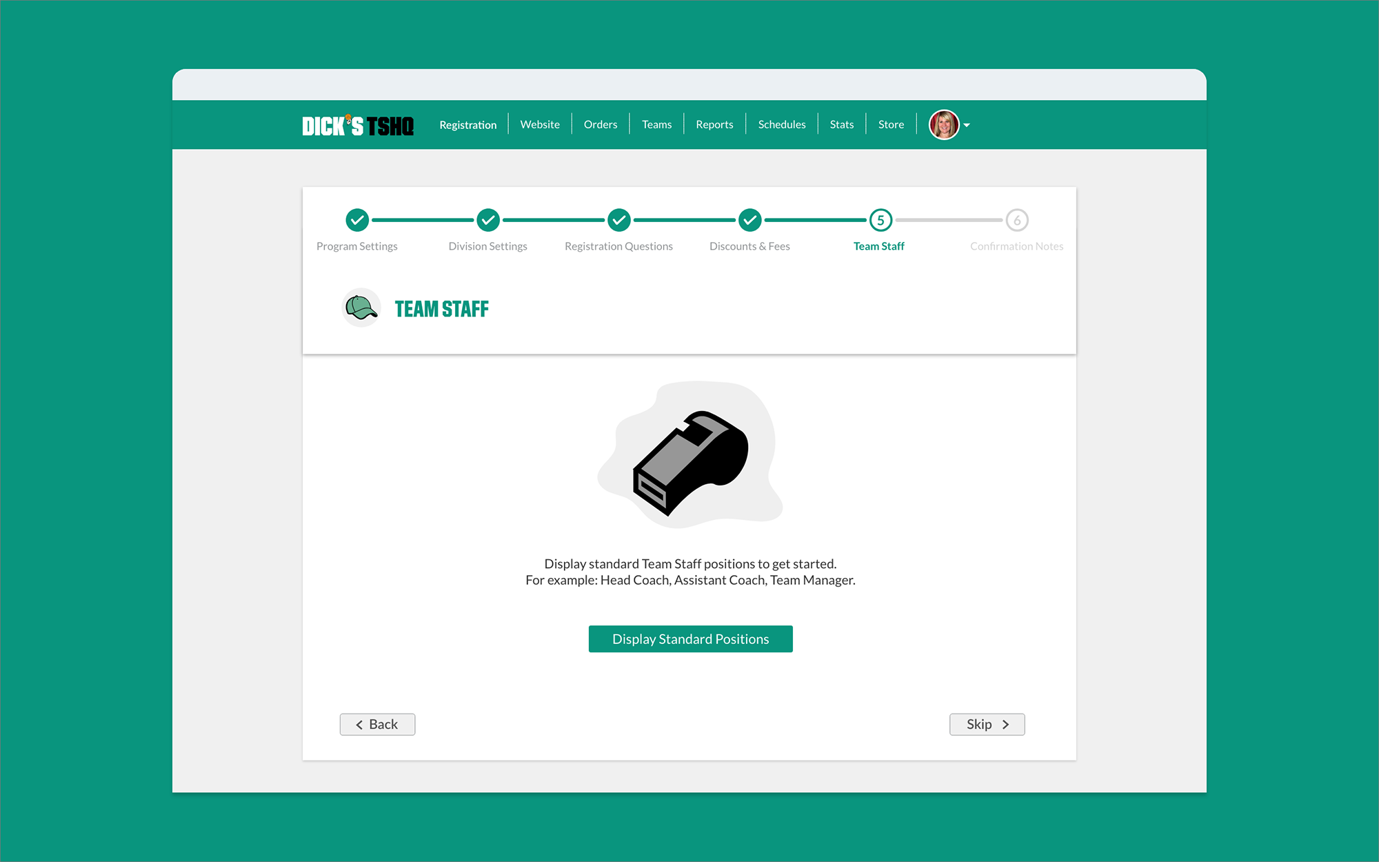
Empty state screens.
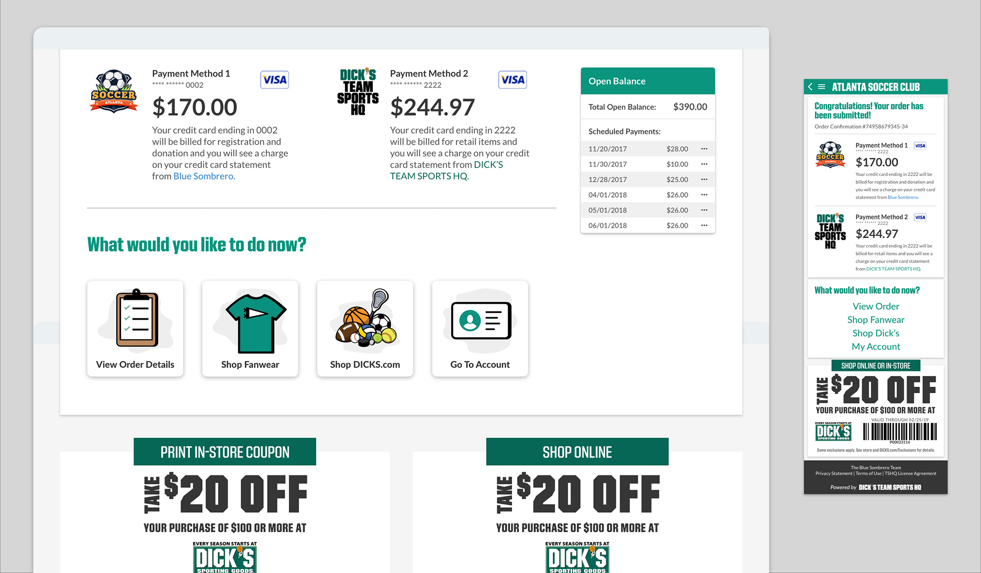
Improve Fan Wear Sales
Fan wear was embedded directly into checkout, not linked to separately, but woven into the flow as a natural next step. No extra navigation required.